Open Food Facts
The genuine design.md file published by Open Food Facts.
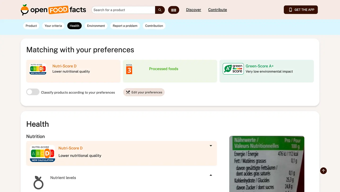
Visit website
Last updated 07/22/2026
DESIGN.md
# Open Food Facts — Design System
> **Format:** This file follows the [Google Stitch DESIGN.md](https://stitch.withgoogle.com/docs/design-md/overview) specification — a standardised, agent-readable way for open-source projects to document their design system in a single, version-controlled file. Coding agents and UI generators must strictly adhere to these design tokens and constraints to ensure brand consistency.
---
## Table of Contents
1. [Overview](#1-overview)
2. [Brand Architecture](#2-brand-architecture)
3. [Design Tokens: Color Palette](#3-design-tokens-color-palette)
4. [Typography Rules](#4-typography-rules)
5. [Logo Implementation & Layout Constraints](#5-logo-implementation--layout-constraints)
6. [Design Principles](#6-design-principles)
7. [Visual Language](#7-visual-language)
- [Iconography](#71-iconography)
- [Grid & Spacing](#72-grid--spacing)
- [Illustrations](#73-illustrations)
- [Animations](#74-animations)
8. [UI Components](#8-ui-components)
- [Buttons](#81-buttons)
- [Forms & Inputs](#82-forms--inputs)
- [Product Cards](#83-product-cards)
- [Navigation Elements](#84-navigation-elements)
- [Modals & Dialogs](#85-modals--dialogs)
- [Data Visualization](#86-data-visualization)
- [Tables](#87-tables)
9. [Page Templates](#9-page-templates)
10. [Avatar System](#10-avatar-system)
11. [Content & Communication](#11-content--communication)
12. [Accessibility](#12-accessibility)
13. [UX Research](#13-ux-research)
14. [Contributing](#14-contributing)
15. [Resources & Tools](#15-resources--tools)
---
## 1. Overview
**Open Food Facts** is a free, open, collaborative database of food products from around the world. This design system documents the visual identity, components, and UX patterns used across all Open Food Facts products — including the mobile app, website, Open Prices, and related tools.
### Products covered
| Product | Repository | Status |
|---|---|---|
| Mobile App (smooth-app) | [openfoodfacts/smooth-app](https://github.com/openfoodfacts/smooth-app) | Active |
| Website (server) | [openfoodfacts/openfoodfacts-server](https://github.com/openfoodfacts/openfoodfacts-server) | Active |
| Explorer (next-gen frontend) | [openfoodfacts/openfoodfacts-explorer](https://github.com/openfoodfacts/openfoodfacts-explorer) | Active |
| Open Prices | [openfoodfacts/open-prices-frontend](https://github.com/openfoodfacts/open-prices-frontend) | Active |
| Taxonomy Editor | [openfoodfacts/taxonomy-editor](https://github.com/openfoodfacts/taxonomy-editor) | Active |
| Hunger Games | [openfoodfacts/hunger-games](https://github.com/openfoodfacts/hunger-games) | Active |
| Web Components | [openfoodfacts/openfoodfacts-webcomponents](https://github.com/openfoodfacts/openfoodfacts-webcomponents) | Active |
| NutriPatrol | [openfoodfacts/nutripatrol-frontend](https://github.com/openfoodfacts/nutripatrol-frontend) | Active |
### Target audiences
- **Consumers** — People looking up product information
- **Journalists** — People researching food data
- **Contributors**
- Catalogue contributors (adding/editing product data)
- Developers (implementing features)
- Designers (contributing to the design system)
---
## 2. Brand Architecture
The Open Food Facts ecosystem consists of four distinct sub-brands. The UI must dynamically adapt its primary accent color depending on the active brand context. All sub-brands share the same foundational design system (typography, spacing, components) but use their designated accent color as the primary UI action color.
| Sub-brand | Token | Hex | Usage context |
|---|---|---|---|
| **Open Food Facts** | `brand-food` | `#FF8714` | Food product pages, food-related flows |
| **Open Beauty Facts** | `brand-beauty` | `#008C8C` | Beauty product pages, beauty-related flows |
| **Open Pet Food Facts** | `brand-pet-food` | `#FF6E78` | Pet food product pages, pet food flows |
| **Open Products Facts** | `brand-products` | `#0064C8` | Generic product pages, fallback brand |
> **For coding agents:** Read the active brand from context (e.g., a `brand` prop, a CSS custom property `--brand-accent`, or a theme variable) and apply the corresponding token as the primary color for buttons, links, focus rings, and other accent elements.
---
## 3. Design Tokens: Color Palette
### Base & Structural Colors
| Token | Value | Usage |
|---|---|---|
| `color-text-primary` | `#000000` | Primary text, headings, high-emphasis labels |
| `color-background-default` | `#F5F5F5` | Default page/screen background |
| `color-surface-white` | `#FFFFFF` | Card surfaces, modal backgrounds, input fills |
| `color-grayscale` | 0%–100% opacity of `#000000` | Dividers, disabled states, secondary text |
### Brand Accent Colors
Map the primary UI action color (`--brand-accent`) to the active brand:
| Token | Hex | Brand |
|---|---|---|
| `brand-food` | `#FF8714` | Open Food Facts (Orange) |
| `brand-beauty` | `#008C8C` | Open Beauty Facts (Turquoise) |
| `brand-pet-food` | `#FF6E78` | Open Pet Food Facts (Pink) |
| `brand-products` | `#0064C8` | Open Products Facts (Blue) |
### Semantic Colors
| Token | Usage |
|---|---|
| `color-success` | Confirming a successful action (e.g., product added) |
| `color-error` | Validation errors, destructive actions |
| `color-warning` | Cautionary information (e.g., allergen alerts) |
| `color-info` | Neutral informational messages |
### Grayscale System
The grayscale is a 100-step scale from 0% to 100% Black (`#000000` with varying opacities). Use named steps for consistency:
| Step | Approximate value | Usage |
|---|---|---|
| `gray-100` | `#F5F5F5` | Background fills |
| `gray-200` | `#E5E5E5` | Dividers, borders |
| `gray-400` | `#BDBDBD` | Placeholder text, disabled borders |
| `gray-600` | `#757575` | Secondary text, captions |
| `gray-800` | `#424242` | Sub-headings, strong secondary text |
| `gray-900` | `#212121` | Near-black text |
### Accessibility
All color combinations must achieve a minimum contrast ratio of **4.5:1** for normal text and **3:1** for large text (18px+ bold or 24px+ regular), in accordance with WCAG 2.1 AA.
---
## 4. Typography Rules
### Primary Typeface: Plus Jakarta Sans
| Property | Value |
|---|---|
| **Family** | `Plus Jakarta Sans` |
| **License** | Open Font License — available via [Google Fonts](https://fonts.google.com/specimen/Plus+Jakarta+Sans) |
| **Usage** | Must be used universally for all UI text, including titles, headings, important keywords, paragraphs, and UI components |
### Available Weights
All weights support both normal and italic styles:
| Weight name | CSS weight value |
|---|---|
| ExtraLight | `200` |
| Light | `300` |
| Regular | `400` |
| Medium | `500` |
| SemiBold | `600` |
| Bold | `700` |
| ExtraBold | `800` |
### Type Scale
| Role | Weight | Size (px) | Line height | Usage |
|---|---|---|---|---|
| Display | ExtraBold (800) | 48–64 | 1.1 | Hero headings, marketing |
| H1 | Bold (700) | 32–40 | 1.2 | Page titles |
| H2 | SemiBold (600) | 24–28 | 1.25 | Section headings |
| H3 | SemiBold (600) | 20–22 | 1.3 | Sub-section headings |
| Body Large | Regular (400) | 18 | 1.6 | Lead paragraphs, introductions |
| Body | Regular (400) | 16 | 1.5 | Main body copy |
| Body Small | Regular (400) | 14 | 1.5 | Captions, metadata |
| Label | Medium (500) | 12–14 | 1.4 | UI labels, badges, tags |
**Type rules:**
- Minimum body text size: **16px** (1rem) — never go below this for body copy
- Never substitute Plus Jakarta Sans with system fonts in production UIs
- For code snippets or technical content, use a system monospace font as a complement only
---
## 5. Logo Implementation & Layout Constraints
The logo is the primary brand asset. All implementations must follow these rules exactly.
### Available Logo Files
| Variant | File | Recommended use |
|---|---|---|
| Horizontal – Light | `images/logos/openfoodfacts/off-logo-horizontal-light.svg` | Light UI backgrounds |
| Horizontal – Dark | `images/logos/openfoodfacts/off-logo-horizontal-dark.svg` | Dark UI backgrounds |
| Horizontal – Mono Black | `images/logos/openfoodfacts/off-logo-horizontal-mono-black.svg` | Single-colour print |
| Horizontal – Mono White | `images/logos/openfoodfacts/off-logo-horizontal-mono-white.svg` | Photography overlays, dark print |
| Vertical – Light | `images/logos/openfoodfacts/off-logo-vertical-light.svg` | Light backgrounds, portrait format |
| Vertical – Dark | `images/logos/openfoodfacts/off-logo-vertical-dark.svg` | Dark backgrounds, portrait format |
| Icon – Light | `images/logos/openfoodfacts/off-logo-icon-light.svg` | App icons, favicons (light context) |
| Icon – Dark | `images/logos/openfoodfacts/off-logo-icon-dark.svg` | App icons, favicons (dark context) |
| Favicon | `images/logos/openfoodfacts/off-logo-favicon-light.png` | Browser tabs |
[ Logo of Open Food Facts](https://www.figma.com/design/HKAAPSQq8CZZO5uAziabRY/New-Open-Food-Facts-logo?m=auto&t=bGdHdz45zaPlgTnW-6)
### Spatial Requirements
- **Safety Margin:** A strict protection grid/safety margin must be maintained around the logo at all times. No text, images, or other UI components may encroach on this padding. Refer to the [Brand Guidelines PDF](./graphic-charter/BRAND%20GUIDELINES_OFF_V1.pdf) for the exact safety margin dimensions.
- **Small Scale Contexts:** For small UI areas (favicons, mobile app icons, social media avatars), strictly use the icon/synthetic single-icon version of the logo (`off-logo-icon-*.svg`) to guarantee legibility. Never use the full horizontal or vertical logo at small sizes.
### Background Adaptation
| UI background | Correct logo variant |
|---|---|
| Light background (`color-surface-white`, `color-background-default`) | Standard color logo (`-light`) or monochrome black (`-mono-black`) |
| Dark background | White/inverted logo (`-dark` or `-mono-white`) to maintain maximum contrast |
| Photography / non-uniform background | Monochrome white (`-mono-white`) for guaranteed readability |
### Visual Integrity — Strict "Do Nots"
> **For coding agents:** These constraints are non-negotiable. Any generated code that violates these rules must be corrected before shipping.
- ❌ **DO NOT** distort the proportions or aspect ratio of the logo (no non-uniform `width`/`height` or `transform: scale(x, y)` with differing values)
- ❌ **DO NOT** alter the core logo colors or apply CSS `filter` properties to the logo element
- ❌ **DO NOT** add `drop-shadow`, `box-shadow`, glows, gradients, or any other visual effects to the logo
- ❌ **DO NOT** apply the logo over non-uniform or low-contrast backgrounds that compromise readability
- ❌ **DO NOT** resize individual elements of the logo independently or remove any of its components
- ❌ **DO NOT** redraw or recreate the logo — always use the provided vector files from `images/logos/`
- ❌ **DO NOT** change the logo axis or rotate it
### Sister Brand Logos
Logos for all sister brands are available in `images/logos/` following the same file-naming conventions:
| Brand | Directory |
|---|---|
| Open Beauty Facts | `images/logos/openbeautyfacts/` |
| Open Pet Food Facts | `images/logos/openpetfoodfacts/` |
| Open Products Facts | `images/logos/openproductsfacts/` |
| Open Prices | `images/logos/openprices/` |
| Green Score | `images/logos/green-score/` |
---
## 6. Design Principles
These principles guide every design decision at Open Food Facts. When in doubt, refer back to them.
| Principle | Description |
|---|---|
| **Clarity** | Present complex nutritional and environmental data in a way that is immediately understandable to any user, regardless of their background. |
| **Data-Driven** | Ground every design decision in real user research and product data. Avoid assumptions; validate with evidence. |
| **Accessibility** | Ensure our products are usable by everyone — including people with disabilities, on slow connections, and on low-end devices. Follow WCAG 2.1 AA as a minimum. |
| **Community-Powered** | Design for contribution. Make it easy for anyone to add or improve product data, and celebrate the community's work. |
| **Iterative** | Ship early, learn fast, and improve continuously. Favour progress over perfection. |
| **Transparency** | Open Food Facts is built on openness — our design process, assets, and decisions should be as open as the data. |
---
## 7. Visual Language
### 7.1 Iconography
Open Food Facts uses icons from multiple sources across its products.
#### Website / Server Icons
The icons used on the Open Food Facts website are stored in the [`icons/` directory of the openfoodfacts-server repository](https://github.com/openfoodfacts/openfoodfacts-server/tree/main/icons). Many of these icons come from [Google Material Symbols and Icons](https://fonts.google.com/icons), supplemented by custom icons designed by [@stephanegigandet](https://github.com/stephanegigandet).
#### Mobile App Icons
The mobile app ([smooth-app](https://github.com/openfoodfacts/smooth-app)) has its own separate iconography:
- **Food Icons (foodicons):** A handcrafted icon font created by [@g123k](https://github.com/g123k), available at [`packages/smooth_app/assets/fonts/`](https://github.com/openfoodfacts/smooth-app/tree/develop/packages/smooth_app/assets/fonts).
- **Other assets:** Additional visual assets used by the mobile app can be found at [`packages/smooth_app/assets/`](https://github.com/openfoodfacts/smooth-app/tree/develop/packages/smooth_app/assets).
#### General Icon Library
For UI components and web tools, **Font Awesome** is also used as a supplementary icon library.
**Usage guidelines:**
- Always pair icons with descriptive text labels when space permits, for accessibility
- Use consistent icon sizing within a given context (e.g., all navigation icons at 24 px)
- Ensure icons meet colour contrast requirements against their background
- Do not use icons alone to convey critical information — always provide a text alternative
- When adding new icons to the server, prefer sourcing from [Google Material Symbols](https://fonts.google.com/icons) for consistency
---
### 7.2 Grid & Spacing
**Spacing system:**
- Base unit: **8px**
- All spacing values should be multiples of 8px (8, 16, 24, 32, 40, 48, 64, 80, 96…)
- Exceptions may be made for 4px where fine adjustments are needed
**Layout grid:**
- Mobile: 4-column grid, 16px margins, 16px gutters
- Tablet: 8-column grid, 24px margins, 24px gutters
- Desktop: 12-column grid, 24–40px margins, 24px gutters
**Design principles for layout:**
- Maintain consistent vertical rhythm through spacing units
- Use grid alignment to create visual order and predictability
- Respect safe zones around the logo and key UI elements
---
### 7.3 Illustrations
Illustrations are available in `images/illustrations/` and are organized by product category.
| Category | Directory | Description |
|---|---|---|
| Food | `images/illustrations/food/` | Food product illustrations (eggs, dairy, pasta, etc.) |
| Beauty | `images/illustrations/beauty/` | Beauty product illustrations |
| Pet Food | `images/illustrations/pet-food/` | Pet food product illustrations |
| Products | `images/illustrations/products/` | Generic product illustrations |
[ Illustrations for Open Food Facts](https://www.figma.com/design/aM6Yu2w3JGBuHTXDHoeUuf/Illustrations?m=auto&t=bGdHdz45zaPlgTnW-6)
**Illustration guidelines (in progress):**
- [ ] Provide guidelines for illustration style
- [ ] Create the most important illustrations so that we stay coherent
**Available food illustrations include:** butter, cheese, chocolate bar, egg, egg carton, flour, fridge, pasta, scale, shopping cart, tomato can, water bottle, yogurt.
#### 7.3.1 Flat Vector Illustration Style Guide
##### Core Visual Principles
Technique: Flat design vector illustration. The image must look as if it was created with vector paths and filled with solid colour (no raster effects, pencil lines, or texture).
Dimensionality: Strictly 2D. Do not include any depth cues, perspective lines, gradients, shadows (soft or hard), or highlights (unless rendered as solid shapes).
Linework: Avoid prominent black outlines. Prefer the contrast between adjacent coloured shapes to define form. If lines must be used (e.g., mouth, implied text on a label, a thin screen edge), they should be minimal, of uniform weight, and a dark, non-black colour.
Simplification: Reduce all elements (characters, objects, animals, etc.) to their most essential geometric forms. A face is a circle; a body is a rectangle. Simplify all details.
##### Character & Figure Guide
Anatomy: Heads are simple circles with dot eyes and a curved line for a mouth. No noses. Ears are simple semicircles. Hands and fingers are simplified to rectangular shapes. Feet are simple block shapes.
Clothing: Represented as simple blocks of solid colour. Features like buttons or pocket flaps are also rendered as simple, solid shapes.
Hair: Solid, blocky shapes without strands or gradients.
##### Colour Palette Guide
Colour Use: Use a limited, intentional, and high-contrast colour palette with no gradients. Adjacent shapes should have a clear visual separation.
Primary Colors: Focus on a limited set. Common choices: Specific oranges, yellows, and teals/blues for objects and accents; a deep green for specific elements; a charcoal or medium grey for clothing or bases.
Secondary/Branding Colors: Light blues for screens or water, pinks and light purples for products/fluids, varying shades of brown for skin and hair.
##### Object & Detail Guide
Objects: Simplify to geometric shapes. Appliances, tools, containers, etc., should be easily identifiable but minimally detailed.
Details: Intricacies are removed. Placeholder elements like text on a label are represented by a few solid parallel lines. Small, abstract floating elements (like small circles for liquid drops) are encouraged to suggest motion or fluid, but they must be flat and solid.
##### Environment & Context
Background: Use a clean, simple, solid-color background (or transparent) without any complex patterns or gradients.
Framing: The composition should be straightforward and centered.
##### Structured Prompt Template
You can use this structure for your prompts, but models work best by adding one or two sample images (an object and a person, and the official logo if needed). As of May 2026, ChatGPT was working well, while NanoBanana was not.
```text
[Subject, e.g., A developer at a desk with a laptop], 2D flat design vector illustration style.
The image uses clean geometric shapes and strictly solid, flat colors, with no gradients,
shadows, or realistic textures. No prominent outlines are present, with form defined by
contrasting color blocks. The character has simplified features: a simple geometric face with
dot eyes and a mouth curve, blocky hair, and clothing represented as simple colored rectangles.
The [Subject's action/objects] are similarly simplified to their essential shapes. Details are
minimal. The color palette is limited to specific oranges, teals, pinks, greys, and browns.
Clean, solid color background. Minimalist composition.
```
---
### 7.4 Animations
Rive animations are stored in `animations/` and are available for use in products.
| Animation | Directory | Description |
|---|---|---|
| Scan + Nutri-Score + Green Score | `animations/scan-nutriscore-greenscore/` | Product scanning animation showing Nutri-Score and Green Score reveal |
**Tools:** Animations are created in [Rive](https://rive.app/).
---
## 8. UI Components
The component library is maintained in Figma. Below are specifications and links for each component category.
> **Note:** All component specifications are subject to the design principles of Clarity, Accessibility, and Consistency outlined in [Section 6](#6-design-principles).
---
### 8.1 Buttons
| Variant | Usage | States |
|---|---|---|
| **Primary** | Main call to action (e.g., "Add Product", "Search") | Default, Hover, Active, Disabled, Loading |
| **Secondary** | Secondary actions (e.g., "Cancel", "Learn More") | Default, Hover, Active, Disabled |
| **Tertiary / Ghost** | Low-emphasis actions (e.g., "Skip", text links) | Default, Hover, Active, Disabled |
| **Destructive** | Irreversible actions (e.g., "Delete") | Default, Hover, Active, Disabled |
| **Icon Button** | Icon-only actions with tooltip | Default, Hover, Active, Disabled |
**Button rules:**
- Always include visible focus states for keyboard navigation
- Minimum touch target size: **44×44px** — internal best practice aligned with WCAG 2.1 AAA (SC 2.5.5 Target Size)
- Disabled buttons must not convey interactivity (no hover effects)
- Loading states should provide feedback without blocking the UI
---
### 8.2 Forms & Inputs
| Element | States |
|---|---|
| Text field | Default, Focus, Filled, Error, Disabled |
| Textarea | Default, Focus, Filled, Error, Disabled |
| Dropdown / Select | Default, Open, Selected, Error, Disabled |
| Checkbox | Unchecked, Checked, Indeterminate, Disabled |
| Radio button | Unselected, Selected, Disabled |
| Toggle / Switch | Off, On, Disabled |
| File upload | Default, Dragging, Uploaded, Error |
**Form rules:**
- All inputs must have visible, descriptive labels (not just placeholder text)
- Error messages must be programmatically associated with their input (`aria-describedby`)
- Required fields must be clearly marked
- Form validation should occur on submission and, where appropriate, on blur
---
### 8.3 Product Cards
Product cards are the primary way products are displayed in search results and lists.
**Card structure:**
1. Product image (with placeholder for missing images)
2. Product name
3. Brand name
4. Nutri-Score badge (A–E)
5. Eco-Score / Green Score badge
6. NOVA group indicator
7. Quantity / weight
**Card variants:**
- **List card** — Horizontal layout for dense list views
- **Grid card** — Vertical layout for grid views
- **Mini card** — Compact version for suggestions / related products
---
### 8.4 Navigation Elements
| Element | Description |
|---|---|
| **Header / App bar** | Primary navigation with logo, search, and user account |
| **Footer** | Site-wide links, legal info, language selector |
| **Tab bar (mobile)** | Bottom navigation for primary app sections |
| **Breadcrumbs** | Hierarchical location indicator for web |
| **Side navigation** | Secondary navigation for settings/profile pages |
| **Search bar** | Prominent global search with autocomplete |
---
### 8.5 Modals & Dialogs
| Type | Usage |
|---|---|
| **Confirmation dialog** | Confirm irreversible actions (e.g., delete, submit) |
| **Information modal** | Display additional context or help content |
| **Form modal** | Collect user input within an overlay |
| **Alert / Toast** | Non-blocking success, error, or warning notifications |
| **Bottom sheet (mobile)** | Mobile-native overlay for contextual actions |
**Modal rules:**
- Always include a clear close/dismiss mechanism
- Trap focus within the modal while it is open
- Return focus to the trigger element on close
- Do not use modals for complex multi-step flows
---
### 8.6 Data Visualization
Open Food Facts relies on rich data scores and visualizations to communicate nutritional and environmental impact.
| Visualization | Description |
|---|---|
| **Nutri-Score** | A–E letter grade with colour coding for nutritional quality |
| **Eco-Score / Green Score** | A–E letter grade for environmental impact |
| **NOVA group** | 1–4 scale for degree of food processing |
| **Ingredient list** | Highlighted ingredient analysis |
| **Nutrient table** | Standard nutritional facts table |
| **Comparison charts** | Bar/radar charts for comparing products |
**Data visualization rules:**
- Never rely on colour alone to convey meaning — always use labels or patterns
- Provide accessible text alternatives for all charts and scores
- Maintain consistent colour coding across the product (e.g., green = good, red = poor)
---
### 8.7 Tables
| Variant | Usage |
|---|---|
| **Data table** | Nutritional facts, product comparisons |
| **Sortable table** | Lists with user-controlled ordering |
| **Responsive table** | Degrades gracefully on small screens (horizontal scroll or card layout) |
---
## 9. Page Templates
These templates define the standard layouts for key pages across Open Food Facts products.
### 9.1 Product Page
The standard layout for a single product's detail page.
**Key sections:**
1. Product header (image gallery, name, brand, quantity)
2. Scores summary (Nutri-Score, Eco-Score, NOVA)
3. Ingredients & allergens
4. Nutritional facts table
5. Environmental impact
6. Product history & edits
7. Related products
8. Contribute / Edit CTA
[ Current Website Design](https://www.figma.com/design/Qg9URUyrjHgYmnDHXRsTTB/Current-Website-design?m=auto&t=jNwvjRR8nIgOzzJZ-6)
---
### 9.2 Search Results Page
**Key sections:**
1. Search bar (persistent, pre-filled with query)
2. Filter & facet panel
3. Results count & sort options
4. Product card grid/list
5. Pagination / infinite scroll
---
### 9.3 User Contribution Flow
**"Add a Product" flow:**
1. Barcode scan / manual entry
2. Product photos upload (front, ingredients, nutrition, other)
3. Basic info (name, brand, quantity)
4. Nutritional facts entry
5. Ingredient list entry
6. Confirmation & submission
**"Edit a Product" flow:**
1. Find product
2. Select field to edit
3. Make edit with source / evidence
4. Submit for review
---
### 9.4 Homepage Template
**Key sections:**
1. Hero / search prompt
2. How it works (3-step explainer)
3. Stats (number of products, contributors, countries)
4. Recent contributions / highlights
5. Mission statement
6. Get involved CTA
---
### 9.5 User Profile & Settings
**Key sections:**
1. Profile header (avatar, username, contribution count)
2. Contribution history
3. Badges / achievements
4. Account settings
5. Notification preferences
6. Privacy settings
---
## 10. Avatar System
The avatar system allows users to create personalised profile avatars using composable SVG components.
**Location (SVG assets):** `avatars/svg/`
**System root (config / JS / HTML / CSS):** `avatars/`
**Structure:** Avatars are composed of stacked SVG layers:
| Body Part | Examples |
|---|---|
| Body | Base body shape |
| Hair | Short, long, curly, etc. |
| Top clothes | T-shirt, sweatshirt, etc. |
| Bottom clothes | Jeans, skirt, etc. |
| Shoes | Sneakers, boots, etc. |
**Technical specifications:**
- All SVG files must be **250×300px**
- Full-width/height canvases — components positioned by their placement within the canvas
- Colors applied directly on SVG elements (`fill:` / `stroke:`) — not via CSS classes
- Use **Inkscape** to create or edit SVG files (not Illustrator)
- Naming convention: `[part].[type].[component].svg` (e.g., `hair.long.top.svg`)
**Configuration:** See `avatars/avatars-config.js` for the full list of parts, types, components, and selectable colours.
---
## 11. Content & Communication
### 11.1 Voice & Tone
Open Food Facts speaks with a voice that is:
| Attribute | Description |
|---|---|
| **Informative** | We provide clear, factual information without overwhelming the user |
| **Neutral** | We present data without bias or judgment |
| **Encouraging** | We celebrate contribution and make users feel their effort matters |
| **Approachable** | We avoid jargon; scientific concepts are explained in plain language |
| **Inclusive** | We speak to all audiences — from curious consumers to expert contributors |
**Tone adapts by context:**
| Context | Tone |
|---|---|
| Product scores | Neutral, factual |
| Onboarding | Warm, encouraging |
| Error messages | Clear, non-blaming, helpful |
| Contribution prompts | Motivating, community-focused |
| Legal / Privacy | Clear, precise |
---
### 11.2 Editorial & Writing Style Guide
**General rules:**
- Use **sentence case** for UI labels, headings, and buttons (not Title Case or ALL CAPS)
- Use **plain language** — aim for a reading level of grade 8 or below for consumer-facing content
- Prefer **active voice** over passive voice
- Keep button labels **action-oriented** (e.g., "Add product", "Edit ingredients", "Save changes")
- Avoid double negatives in error messages or instructions
**Terminology standards:**
| Term | Use | Avoid |
|---|---|---|
| Open Food Facts | Full name on first mention | OFF (except in code/URLs) |
| Nutri-Score | With hyphen, both words capitalised | Nutriscore, nutri score |
| Eco-Score | With hyphen, both words capitalised | Ecoscore |
| Green Score | Two words, both capitalised | Greenscore |
| NOVA | All caps (it's an acronym) | Nova, nova |
| Contributor | Generic term for anyone adding data | User, member |
| Product | The item being catalogued | Item, entry |
**Microcopy guidelines:**
- Write labels for the component, not for the page
- Validation errors should explain what went wrong AND how to fix it
- Empty states should be helpful and encourage action
- Loading states should set expectations (e.g., "Searching products…")
- Follow platform conventions for platform-specific microcopy (iOS vs Android vs Web)
---
## 12. Accessibility
Open Food Facts is committed to making its products usable by everyone.
**Standard:** WCAG 2.1 Level AA
### 12.1 Checklist for Designers
**Colour & Contrast:**
- [ ] Text contrast ratio ≥ 4.5:1 (normal text), ≥ 3:1 (large text / UI components)
- [ ] Do not rely on colour alone to convey meaning
- [ ] Provide visible focus indicators on all interactive elements
**Typography & Readability:**
- [ ] Body text minimum 16px
- [ ] Text can be resized up to 200% without loss of content or functionality
- [ ] Line height ≥ 1.5 for body text
**Interaction:**
- [ ] All interactive elements are keyboard-navigable
- [ ] Touch targets are at least 44×44px (WCAG 2.1 AAA / internal best practice; stricter than our AA baseline)
- [ ] No interactions that require fine motor control only (e.g., hover-only)
- [ ] Provide alternatives for time-limited interactions
**Images & Media:**
- [ ] All meaningful images have descriptive `alt` text
- [ ] Decorative images have empty `alt=""` attribute
- [ ] Videos have captions; audio has transcripts
**Forms:**
- [ ] All inputs have visible labels
- [ ] Error messages are clear and programmatically associated
- [ ] Autocomplete attributes are used where appropriate
**Navigation:**
- [ ] Page titles are unique and descriptive
- [ ] Headings follow a logical hierarchy (H1 → H2 → H3)
- [ ] Skip-to-content link is available
- [ ] Focus order is logical and meaningful
**Assistive Technologies:**
- [ ] Tested with screen readers (e.g., NVDA, VoiceOver, TalkBack)
- [ ] ARIA roles and attributes used only when native HTML is insufficient
- [ ] Dynamic content updates are announced to screen readers
---
## 13. UX Research
UX research at Open Food Facts is conducted systematically to ensure design decisions are grounded in user needs.
### 13.1 Research Process
Research follows a structured 14-step process documented in [`UXR Ops/UX Research Process Flow Overview.md`](./UXR%20Ops/UX%20Research%20Process%20Flow%20Overview.md):
1. Identify the research need
2. Stakeholder interview (define goals, metrics, risks)
3. Identify target users
4. Choose research methods
5. Create research plan
6. Recruit participants
7. Create study materials
8. Conduct pilot study
9. Obtain informed consent (GDPR-compliant)
10. Conduct study
11. Analyse data
12. Share report
13. Discuss findings with team
14. Schedule follow-up
### 13.2 Research Methods Used
| Method | Phase | Output |
|---|---|---|
| UX Audit | Foundation | Heuristic issues, improvement areas |
| Heuristic Evaluation | Foundation | Usability violations (Nielsen's 10 principles) |
| Value Proposition Canvas | Foundation | User needs, gains, and pain points |
| User Interviews | Discovery | Proto-personas, JTBD, pain points |
| Survey | Validation | Quantitative JTBD validation, persona data |
| Usability Testing | Evaluation | UX issues, design recommendations |
### 13.3 Research Repository
Research reports are stored in [`UXR Reports Repository/`](./UXR%20Reports%20Repository/) following the naming convention:
```
[YYYY Q] Project Name: Topic
```
Example: `[2025 Q2] Open Prices: Onboarding Flow`
### 13.4 Active Research Areas
- **Open Food Facts (OFF):** General website UX audit — [`UXR OFF/`](./UXR%20OFF/)
- **Open Prices:** UX audit, usability testing, contribution flow research — [`UXR Open Prices/`](./UXR%20Open%20Prices/)
---
## 14. Contributing
We welcome contributions to the design system from designers, developers, and UX researchers.
### Getting started
1. Review the [Contributing Guide](./CONTRIBUTING.md)
2. Request access to [Figma](https://www.figma.com/) (view access by default; edit access on request)
3. Join the [#design channel on Slack](https://slack.openfoodfacts.org)
### Design contribution workflow
1. **Fork & branch** — Create a new branch for your work
2. **Propose in Figma** — Sketch your changes in the relevant Figma file
3. **Open an issue** — Describe the problem and your proposed solution
4. **Pull request** — Submit a PR with your changes (design files, documentation, or assets)
5. **Review** — Request feedback from the design team
6. **Merge** — After approval, your contribution is merged
### Design meetings
**Design team weekly (Fridays 09:00 Paris / 08:00 London / 11:30 IST):**
- Internal design discussions and decisions
**Office hours (Designers, Developers & Community — Fridays 09:00 Paris):**
- Open to everyone; integration of design into the development process
Add events via the [Open Food Facts Community Calendar](https://wiki.openfoodfacts.org/Events).
---
## 15. Resources & Tools
### 15.1 Design files by project
#### Mobile App
[ Mobile App Design (current + future plans)](https://www.figma.com/file/nFMjewFAOa8c4ahtob7CAB/Mobile-App-Design-(Quentin)?node-id=0%3A1&t=SrBuT7gBdhapUerx-0)
[ App Store / Play Store Vignettes](https://www.figma.com/file/loMFSX1wJ61jjuZkSeLV7e/Vignettes-App-Design-\(Quentin\)?node-id=3248%3A324)
#### Website
[ Current Website Design](https://www.figma.com/design/Qg9URUyrjHgYmnDHXRsTTB/Current-Website-design?m=auto&t=jNwvjRR8nIgOzzJZ-6)
[ Explorer — Next-gen Frontend](https://www.figma.com/design/pgWZAEX1ZoTt0f7Azek4AV/Open-Food-Facts-Explorer-(next-gen-frontend)?node-id=1-53&t=XfEkgmUsvs6qiKr9-0)
#### Open Prices
[ Open Prices (Web)](https://www.figma.com/design/cIB7CInl2BfueMzWnz09t6/Open-Prices?node-id=0-1&p=f&t=LC7UvPjngw57NGSs-0)
[ Open Prices (Mobile)](https://www.figma.com/design/nFMjewFAOa8c4ahtob7CAB/Mobile-App-Design--Quentin-?node-id=5816-22697&p=f&t=AkgTM9QzMK7tQeGC-0)
[ Prixing Benchmark](https://www.figma.com/design/XQYkLGKlcotBPpwKMhDe1z/Prixing---Benchmark?m=auto&t=AkgTM9QzMK7tQeGC-6)
#### Web Tools & Extensions
[ Taxonomy Editor](https://www.figma.com/file/7QxD2pOnVntjDPqbHHPGHv/Taxonomy-Editor?t=4YadI2GgSAXcPnlo-0)
[ Hunger Games](https://www.figma.com/design/pngqJwPkytFik6h4EW396n/Hunger-Games?node-id=801-2&p=f&t=xQnrkht1cbTJGOw9-0)
[ Web Components](https://www.figma.com/design/X8nBndPdBfikAcevBiBxKo/Web-Components?node-id=0-1&p=f&t=A7yCwKqyW9klqYq8-0)
[ NutriPatrol](https://www.figma.com/design/SRU9iQ5DIpKNa6izKEiqyo/NutriPatrol--quality-?node-id=48-36&p=f&t=Ly2rYxJgs4fcTane-0)
[ Folksonomy Engine](https://www.figma.com/design/uEtDC3hqIZZeOs6AQAed3D/Folksonomy-Engine--n%C3%A9e-OpenLists-?node-id=614-2&p=f&t=Ly2rYxJgs4fcTane-0)
[ Search-A-Licious Logo](https://www.figma.com/design/gNnI56OF91Ugdd4fBaq5F8/Search-A-Licious-Logo?m=auto&t=bEHMawF1eequkY9w-6)
[ DriveOFF (Browser Extension)](https://www.figma.com/design/DHvAhrqU1TBaVkzyTcqXOT/DriveOFF---Chrome-extension-for-shopping?m=auto&t=tdB5zkxiDiU0bMVh-6)
#### Brand & Identity
[ Open Food Facts Logo](https://www.figma.com/design/HKAAPSQq8CZZO5uAziabRY/New-Open-Food-Facts-logo?m=auto&t=bGdHdz45zaPlgTnW-6)
[ Illustrations](https://www.figma.com/design/aM6Yu2w3JGBuHTXDHoeUuf/Illustrations?m=auto&t=bGdHdz45zaPlgTnW-6)
---
### 15.2 Asset library (this repository)
| Asset type | Location |
|---|---|
| Open Food Facts logos | `images/logos/openfoodfacts/` |
| Open Beauty Facts logos | `images/logos/openbeautyfacts/` |
| Open Pet Food Facts logos | `images/logos/openpetfoodfacts/` |
| Open Products Facts logos | `images/logos/openproductsfacts/` |
| Open Prices logos | `images/logos/openprices/` |
| Green Score logos | `images/logos/green-score/` |
| UN SDG Goals | `images/logos/un-sdg-goals/` |
| Food illustrations | `images/illustrations/food/` |
| Beauty illustrations | `images/illustrations/beauty/` |
| Pet food illustrations | `images/illustrations/pet-food/` |
| Product illustrations | `images/illustrations/products/` |
| Rive animations | `animations/` |
| Avatar SVGs | `avatars/svg/` |
| Brand guidelines PDF | `graphic-charter/BRAND GUIDELINES_OFF_V1.pdf` |
---
### 15.3 External links
| Resource | Link |
|---|---|
| Open Food Facts website | [openfoodfacts.org](https://openfoodfacts.org/) |
| Open Food Facts GitHub | [github.com/openfoodfacts](https://github.com/openfoodfacts/) |
| Design Wiki | [wiki.openfoodfacts.org/Design](https://wiki.openfoodfacts.org/Design) |
| Slack #design channel | [slack.openfoodfacts.org](https://slack.openfoodfacts.org) |
| WCAG 2.1 Guidelines | [w3.org/WAI/standards-guidelines/wcag](https://www.w3.org/WAI/standards-guidelines/wcag/) |
| Design Community project | [github.com/orgs/openfoodfacts/projects/76](https://github.com/orgs/openfoodfacts/projects/76) |
| Design System project | [github.com/orgs/openfoodfacts/projects/75](https://github.com/orgs/openfoodfacts/projects/75) |
| UXR & Design backlog | [github.com/orgs/openfoodfacts/projects/11](https://github.com/orgs/openfoodfacts/projects/11) |
| Plus Jakarta Sans font | [fonts.google.com/specimen/Plus+Jakarta+Sans](https://fonts.google.com/specimen/Plus+Jakarta+Sans) |
| Google Stitch DESIGN.md spec | [stitch.withgoogle.com/docs/design-md/overview](https://stitch.withgoogle.com/docs/design-md/overview) |
---
*Last updated: April 2026 — Maintained by the Open Food Facts Design team. Contributions welcome via [GitHub issues](https://github.com/openfoodfacts/openfoodfacts-design/issues) or the [#design Slack channel](https://slack.openfoodfacts.org).*