
QuiverAI
The genuine design.md file published by QuiverAI.
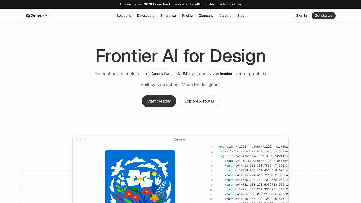
Visit website
Last updated 07/29/2026
#sidebar-collapsed: 3rem
#sidebar-expanded: 13rem
#page-x: 1rem
#page-xlg: 2rem
#page-y: 2rem
#2xl: 1.075rem
#3xl: 1.325rem
#4xl: 1.625rem
---
version: "alpha"
name: "QuiverAI Visual Language"
description: "QuiverAI's visual identity, design tokens, and usage guidance."
colors:
  raw-amber-100: "#fef3c7"
  raw-amber-200: "#fde68a"
  raw-amber-300: "#fcd34d"
  raw-amber-400: "#fbbf24"
  raw-amber-50: "#fffbeb"
  raw-amber-500: "#f59e0b"
  raw-amber-600: "#d97706"
  raw-amber-700: "#b45309"
  raw-amber-800: "#92400e"
  raw-amber-900: "#78350f"
  raw-amber-950: "#451a03"
  raw-black: "#000000"
  raw-blue-100: "#dbeafe"
  raw-blue-200: "#bfdbfe"
  raw-blue-300: "#93c5fd"
  raw-blue-400: "#60a5fa"
  raw-blue-50: "#eff6ff"
  raw-blue-500: "#3b82f6"
  raw-blue-600: "#2563eb"
  raw-blue-700: "#1d4ed8"
  raw-blue-800: "#1e40af"
  raw-blue-900: "#1e3a8a"
  raw-green-100: "#dcfce7"
  raw-green-200: "#bbf7d0"
  raw-green-300: "#86efac"
  raw-green-400: "#4ade80"
  raw-green-50: "#f0fdf4"
  raw-green-500: "#22c55e"
  raw-green-600: "#16a34a"
  raw-green-700: "#15803d"
  raw-green-800: "#166534"
  raw-green-900: "#14532d"
  raw-neutral-100: "#f8f8f8"
  raw-neutral-200: "#e5e5e5"
  raw-neutral-300: "#d4d4d4"
  raw-neutral-400: "#a3a3a3"
  raw-neutral-50: "#fcfcfc"
  raw-neutral-500: "#737373"
  raw-neutral-600: "#525252"
  raw-neutral-700: "#404040"
  raw-neutral-800: "#262626"
  raw-neutral-900: "#171717"
  raw-neutral-950: "#0a0a0a"
  raw-red-100: "#fee2e2"
  raw-red-200: "#fecaca"
  raw-red-300: "#fca5a5"
  raw-red-400: "#f87171"
  raw-red-50: "#fef2f2"
  raw-red-500: "#ef4444"
  raw-red-600: "#dc2626"
  raw-red-700: "#b91c1c"
  raw-red-800: "#991b1b"
  raw-red-900: "#7f1d1d"
  raw-white: "#ffffff"
  accent: "oklch(0.9551 0 0)"
  accent-foreground: "oklch(0.205 0 0)"
  background: "oklch(0.9851 0 0)"
  border: "oklch(0.922 0 0)"
  card: "oklch(1 0 0)"
  card-foreground: "oklch(0.2244 0.0031 17.3887)"
  chart-1: "oklch(0.8116 0.0964 254.0678)"
  chart-2: "oklch(0.625 0.186 262.2807)"
  chart-3: "oklch(0.553 0.2176 264.9317)"
  chart-4: "oklch(0.4948 0.2164 266.9803)"
  chart-5: "oklch(0.4329 0.1728 273.4775)"
  destructive: "oklch(0.5647 0.2074 32.9864)"
  foreground: "oklch(0.145 0 0)"
  info: "oklch(0.5461 0.2152 262.8809)"
  info-foreground: "oklch(1 0 0)"
  info-soft: "oklch(0.9705 0.0142 254.6042)"
  input: "oklch(0.922 0 0)"
  muted: "oklch(0.9612 0 0)"
  muted-foreground: "oklch(0.556 0 0)"
  overlay: "oklch(0 0 0)"
  popover: "oklch(0.9851 0 0)"
  popover-foreground: "oklch(0.145 0 0)"
  primary: "oklch(0.2686 0 0)"
  primary-foreground: "oklch(1 0 0)"
  ring: "oklch(0.145 0 0)"
  secondary: "oklch(1 0 0)"
  secondary-foreground: "oklch(0.2046 0 0)"
  sidebar: "oklch(0.9731 0 0)"
  sidebar-accent: "oklch(0.9461 0 0)"
  sidebar-accent-foreground: "oklch(0 0 0)"
  sidebar-border: "oklch(0.922 0 0)"
  sidebar-foreground: "oklch(0.2992 0.0029 17.318)"
  sidebar-primary: "oklch(0.2686 0 0)"
  sidebar-primary-foreground: "oklch(0.985 0 0)"
  sidebar-ring: "oklch(0.145 0 0)"
  soft: "oklch(0.9431 0 0)"
  success: "oklch(0.59 0.13 150)"
  success-soft: "oklch(0.965 0.03 155)"
  surface: "oklch(0.9792 0 0)"
  warning: "oklch(0.2791 0.0742 45.6352)"
  warning-border: "oklch(0.9243 0.1151 95.7459)"
  warning-soft: "oklch(0.9619 0.058 95.6174)"
typography:
  copy:
    fontSize: "0.875rem"
  copy-lg:
    fontSize: "1rem"
  copy-sm:
    fontSize: "0.75rem"
    lineHeight: "1.1rem"
  copy-xl:
    fontSize: "1.125rem"
  copy-xs:
    fontSize: "0.625rem"
  label:
    fontSize: "0.875rem"
  title:
    fontSize: "2.25rem"
  title-lg:
    fontSize: "3rem"
  title-md:
    fontSize: "1.5rem"
  title-sm:
    fontSize: "1.25rem"
rounded:
  2xl: "1.075rem"
  3xl: "1.325rem"
  4xl: "1.625rem"
  lg: "0.625rem"
  md: "0.5rem"
  sm: "0.375rem"
  xl: "0.875rem"
spacing:
  sidebar-collapsed: "3rem"
  sidebar-expanded: "13rem"
  page-x: "1rem"
  page-xlg: "2rem"
  page-y: "2rem"
  page-ylg: "2.5rem"
  stack: "1.5rem"
---

## Overview

QuiverAI's design language is quiet, neutral, and utility-first. Shared tokens
provide the visual contract; `@quiverai/ui` provides the reusable component
contract.

## Colors

- Use semantic color tokens in app code.
- Use `raw-*` palette tokens only when defining or extending tokens.
- Use `primary` for the main action and `destructive` only when an action is
  irreversible or dangerous.
- Use `info`, `success`, and `warning` for their named intents rather than for
  decorative accents.

### Surface ladder

Which token to reach for, by what the surface _is_. shadcn/ui's vocabulary is
the product vocabulary, so these names match its docs and any component you pull
from upstream.

| Surface                                                    | Token           |
| ---------------------------------------------------------- | --------------- |
| Page, app shell                                            | `bg-background` |
| Sidebar, nav shell                                         | `bg-sidebar`    |
| Raised panel -- card, dialog                               | `bg-card`       |
| Floating panel -- popover, dropdown, select, command       | `bg-popover`    |
| Recessed well or track -- progress, slider, tabs, skeleton | `bg-muted`      |
| Field -- input, textarea, select trigger                   | `bg-background` |
| Hover and highlight                                        | `bg-accent`     |
| Solid brand fill -- primary button                         | `bg-primary`    |
| Border, divider, rule                                      | `border-border` |
| Focus ring                                                 | `ring-ring`     |

If a component already exists in `@quiverai/ui`, read the token off that
component instead of choosing from this table -- the decision was made once,
there.

### Intents

`primary`, `destructive`, `warning` and `success` are deliberately
property-agnostic: one token serves `bg-`, `text-` and `border-`. Pair a
solid fill with its `-foreground` for the text on top, and use `-soft` for a
tinted alert or badge background.

`warning`, `success` and the `-soft` variants are our extensions -- shadcn
ships only `destructive`. They follow its naming conventions so that if upstream
ever adds them we converge rather than collide.

Info's tinted-surface border is expressed natively as `border-info/30`, the same
opacity move stock uses for `border-destructive/30`; there is no `info-border`
token. `warning` is the exception: it is a near-black brown, so `warning/30`
computes to muddy grey rather than amber, and it keeps a dedicated
`warning-border` token.

### Panel edges

Raised panels use `ring-1 ring-foreground/10` for their hairline edge, which is
what shadcn itself does. `ring-ring` is the focus ring and nothing else -- it
resolves to `border`, so a 10% hairline of it is invisible.

### Adding a token

Start from shadcn's set and add only on demand. Prefer an opacity modifier
(`bg-destructive/10`) while something is used in one place; promote it to a real
token once a second consumer needs it. A speculative token is worse than a
missing one -- the previous vocabulary carried 78 tokens of which 31 were never
referenced by anything.

### Interaction states

- Disabled is expressed with `opacity-50`, never a background change.
- Dark mode is expressed with the `.dark` variant; do not use `light-dark()`.

## Typography

- Use Geist Variable for body and display text.
- Use Geist Mono for code and compact labels.
- Use the generated typography tokens only.
- Use the fewest weights needed to establish hierarchy; do not introduce a new
  font family or weight without a design decision.

## Layout

- Use the generated spacing tokens for padding, margin, and gaps.
- Prefer the page and stack tokens for shared surfaces; component-specific
  density belongs in the component implementation.

## Elevation & Depth

- Use the generated shadow tokens only.
- Prefer borders, rings, and surface contrast before adding elevation.
- Use elevation only for floating or clearly raised surfaces.

## Shapes

- Use the generated radius tokens only.
- Keep related controls on the same radius rung.
- Use the larger radius rungs for containers and the smaller rungs for compact
  controls.

## Components

- `@quiverai/ui`
- Use existing `@quiverai/ui` components before creating a new visual pattern.
- Keep product-specific behavior in the consuming app, not in this token
  package.

## Do's and Don'ts

- Do keep this file synced with `packages/design/tokens/quiver.tokens.json` and
  its generated outputs.
- Do keep token names aligned with the CSS variables used by the shared UI package.
- Don't add aspirational tokens that do not exist in the implementation.