---
version: alpha
name: Nuxt
description: Nuxt design system, powered by Nuxt UI and Tailwind CSS v4. Dark mode is the default theme.
brand:
  green: "#00DC82"
  navy: "#020420"
  white: "#FFFFFF"
theme:
  font-sans: "'Public Sans', sans-serif"
  color-green-50: "#EFFDF5"
  color-green-100: "#D9FBE8"
  color-green-200: "#B3F5D1"
  color-green-300: "#75EDAE"
  color-green-400: "#00DC82"
  color-green-500: "#00C16A"
  color-green-600: "#00A155"
  color-green-700: "#007F45"
  color-green-800: "#016538"
  color-green-900: "#0A5331"
  color-green-950: "#052E16"
semantic-colors:
  primary: green
  neutral: slate
  important: violet
  secondary: blue
  success: green
  info: blue
  warning: yellow
  error: red
css-variables:
  ui-container: 90rem
  ui-header-height: 112px
  ui-bg-dark: "var(--ui-color-neutral-950)"
  ui-bg-muted-dark: "var(--ui-color-neutral-900)"
  ui-bg-elevated-dark: "var(--ui-color-neutral-900)"
  ui-bg-accented-dark: "var(--ui-color-neutral-800)"
text:
  dimmed: "text-dimmed"
  muted: "text-muted"
  toned: "text-toned"
  default: "text-default"
  highlighted: "text-highlighted"
  inverted: "text-inverted"
background:
  default: "bg-default"
  muted: "bg-muted"
  elevated: "bg-elevated"
  accented: "bg-accented"
  inverted: "bg-inverted"
border:
  default: "border-default"
  muted: "border-muted"
  accented: "border-accented"
  inverted: "border-inverted"
radius:
  base: "var(--ui-radius)"
  utilities: [xs, sm, md, lg, xl, 2xl, 3xl]
components:
  button-primary: 'UButton color="primary"'
  button-secondary: 'UButton color="neutral" variant="subtle"'
  button-ghost: 'UButton variant="ghost"'
  button-error: 'UButton color="error"'
  input: 'UInput'
  container: 'UContainer'
  page-hero: 'UPageHero'
  prose: 'prose prose-primary dark:prose-invert'
---

# Nuxt

## Overview

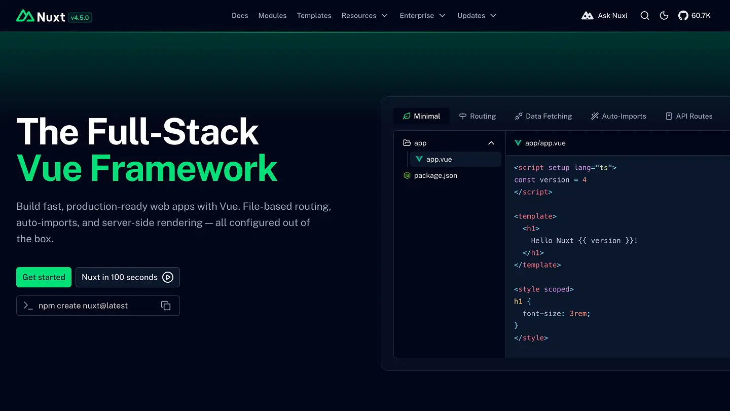
Nuxt is the design language for Nuxt products and communications. The aesthetic is developer-focused and confident: deep navy surfaces, Nuxt green as the single accent, and generous whitespace. Prioritize readability, accessibility, and clarity over decoration. Use color to signal state or hierarchy, not to fill space.

The system is powered by [Nuxt UI](https://ui.nuxt.com) and **Tailwind CSS v4**, with **CSS variables** as design tokens. Colors are semantic (`primary`, `neutral`, `error`…) rather than hardcoded hex values in components. Dark mode is the default theme.

Logo assets and downloadable brand files live at [/design-kit](/design-kit).

## Tailwind CSS

Theme tokens are defined with the `@theme` directive:

```css
@import "tailwindcss";
@import "@nuxt/ui";

@theme static {
  --font-sans: 'Public Sans', sans-serif;
  --color-green-50: #EFFDF5;
  /* … green-100 through green-950 … */
  --color-green-400: #00DC82;
}

:root {
  --ui-container: 90rem;
}

.dark {
  --ui-bg: var(--ui-color-neutral-950);
  --ui-bg-muted: var(--ui-color-neutral-900);
  --ui-bg-elevated: var(--ui-color-neutral-900);
  --ui-bg-accented: var(--ui-color-neutral-800);
}
```

See the [Nuxt UI design system docs](https://ui.nuxt.com/docs/getting-started/theme/design-system) for full `@theme` customization options.

## Brand colors

These are the Nuxt marketing colors, distinct from Nuxt UI semantic tokens:

| Name | Hex | Usage |
|------|-----|-------|
| Green | `#00DC82` | Logo, brand accent. Maps to `green-400` in `@theme`. |
| Navy | `#020420` | Dark backgrounds, OG images, `theme-color` meta. |
| White | `#FFFFFF` | Text on dark surfaces, light logo variants. |

The full green scale (`green-50`–`green-950`) is defined in `@theme static` and powers the `primary` semantic color.

## Semantic colors

Nuxt UI maps semantic aliases to Tailwind color scales via runtime config:

| Semantic | Maps to | Usage |
|----------|---------|-------|
| `primary` | `green` | CTAs, links, active nav, brand elements |
| `neutral` | `slate` | Text, borders, backgrounds, disabled states |
| `important` | `violet` | Highlighted badges and emphasis |
| `secondary` | `blue` (default) | Secondary actions |
| `success` | `green` (default) | Success states |
| `info` | `blue` (default) | Info alerts, tooltips |
| `warning` | `yellow` (default) | Warnings, pending states |
| `error` | `red` (default) | Errors, destructive actions |

Use the `color` prop on Nuxt UI components:

```vue
<UButton color="primary">Get Started</UButton>
<UButton color="neutral" variant="subtle">Learn More</UButton>
<UButton color="error">Delete</UButton>
```

Registered theme colors: `primary`, `secondary`, `info`, `success`, `warning`, `error`, `important`.

## CSS variables

Nuxt UI exposes semantic utility classes backed by `--ui-*` CSS variables. See the [CSS variables docs](https://ui.nuxt.com/docs/getting-started/theme/css-variables).

### Color utilities

`text-primary`, `bg-success`, `border-error`, etc. — each resolves to a shade of the mapped color scale. Light mode uses `-500` shades; dark mode uses `-400`.

### Text hierarchy

| Class | Role |
|-------|------|
| `text-dimmed` | Disabled, placeholder |
| `text-muted` | Secondary text, captions |
| `text-toned` | Tertiary text |
| `text-default` | Body text |
| `text-highlighted` | Headings, emphasis |
| `text-inverted` | Text on inverted backgrounds |

### Background hierarchy

| Class | Role |
|-------|------|
| `bg-default` | Page surface |
| `bg-muted` | Subtle fill, grouped content |
| `bg-elevated` | Cards, popovers |
| `bg-accented` | Hover states, active panels |
| `bg-inverted` | Inverted surface |

The dark theme overrides `--ui-bg` to `neutral-950` (deeper than the Nuxt UI default `neutral-900`) for a navy-adjacent feel.

### Border hierarchy

| Class | Role |
|-------|------|
| `border-default` | Standard borders |
| `border-muted` | Subtle dividers |
| `border-accented` | Emphasized borders |
| `border-inverted` | Borders on inverted surfaces |

Cards and modules typically use `border border-default` on `bg-elevated` or `bg-muted`.

## Typography

**Font:** Public Sans (`--font-sans`), loaded via `@nuxt/fonts`.

Nuxt UI does not ship a fixed type scale like a dedicated design system. Use Tailwind utilities:

| Context | Typical classes |
|---------|----------------|
| Page hero | `text-5xl sm:text-7xl font-semibold` |
| Section hero | `sm:text-5xl font-semibold` |
| Section headings | `text-2xl`–`text-4xl font-semibold` |
| Body / prose | `prose prose-primary dark:prose-invert` |
| UI labels | `text-sm`, `text-xs` |
| Code | `font-mono`, Shiki-highlighted blocks |

Prefer semantic text classes (`text-highlighted`, `text-muted`) over raw slate colors.

## Layout

### Container

`--ui-container: 90rem` — used by `UContainer`.

### Header

`--ui-header-height: 112px` on large screens for docs and marketing layouts.

### Spacing

Tailwind's default 4px-based spacing scale. Common rhythm:

- `gap-2` / `p-2` (8px) — inside a group
- `gap-4` / `p-4` (16px) — between related items
- `py-10 sm:py-20` — section padding
- `py-24 sm:py-32 lg:py-40` — hero sections

### Breakpoints

Tailwind defaults: `sm` 640px, `md` 768px, `lg` 1024px, `xl` 1280px, `2xl` 1536px.

## Radius

Nuxt UI derives all `rounded-*` utilities from a single `--ui-radius` base (default `0.25rem`). Available: `rounded-xs`, `rounded-sm`, `rounded-md`, `rounded-lg`, `rounded-xl`, `rounded-2xl`, `rounded-3xl`.

Cards and controls typically use `rounded-lg` or `rounded-md`. Hero panels may use `rounded-2xl`.

## Components

Use Nuxt UI primitives — do not rebuild what already exists:

| Pattern | Component | Example |
|---------|-----------|---------|
| Primary action | `UButton` | `<UButton color="primary">Deploy</UButton>` |
| Secondary action | `UButton` | `<UButton color="neutral" variant="subtle">Cancel</UButton>` |
| Tertiary / link | `UButton` | `<UButton variant="ghost">Docs</UButton>` |
| Destructive | `UButton` | `<UButton color="error">Delete</UButton>` |
| Form input | `UInput` | `<UInput placeholder="Search modules" />` |
| Page layout | `UPage`, `UPageHero`, `UPageBody` | Marketing and docs pages |
| Content | `ContentRenderer` + prose | Markdown/MDC content |
| Navigation | `UHeader`, `UNavigationMenu` | App header |

Focus rings are handled by Nuxt UI (`outline-primary/25` on `:focus-visible`). Do not remove outlines without a visible replacement.

## Motion

Use motion sparingly. Honor `prefers-reduced-motion`. Nuxt UI components include sensible default transitions for modals, popovers, and menus.

## Voice & Content

- Title Case for labels, buttons, titles, and tabs; sentence case for body and helper text.
- Name actions with a verb and a noun (`Deploy Project`, `Install Module`).
- Write errors as what happened plus what to do next.
- Toasts name the specific thing that changed — no trailing period, no "successfully".
- Empty states point to the first action.
- In-progress states use present participle + ellipsis: `Deploying…`.

## Do's and Don'ts

- Use semantic color props (`color="primary"`) and utility classes (`text-muted`, `bg-elevated`) — not raw hex in components.
- Use the green `primary` color for the main call to action on a view.
- Rank text with `text-highlighted` > `text-default` > `text-muted` > `text-dimmed`.
- Hold WCAG AA contrast (4.5:1 for body text).
- Don't signal state with color alone; pair with an icon or label.
- Don't hardcode `#00DC82` in UI code — use `text-primary` or `color="primary"`.
- Don't use the wordmark without the mountain symbol — see [/design-kit](/design-kit).

## Resources

- Brand assets (logos, icons): [/design-kit](/design-kit)
- Figma brand kit: [Nuxt Brand Kit](https://www.figma.com/community/file/1296154408275753939/nuxt-brand-kit)
- Nuxt UI design system: [ui.nuxt.com/docs/getting-started/theme/design-system](https://ui.nuxt.com/docs/getting-started/theme/design-system)
- Nuxt UI CSS variables: [ui.nuxt.com/docs/getting-started/theme/css-variables](https://ui.nuxt.com/docs/getting-started/theme/css-variables)