
Culture Amp
The genuine design.md file published by Culture Amp.
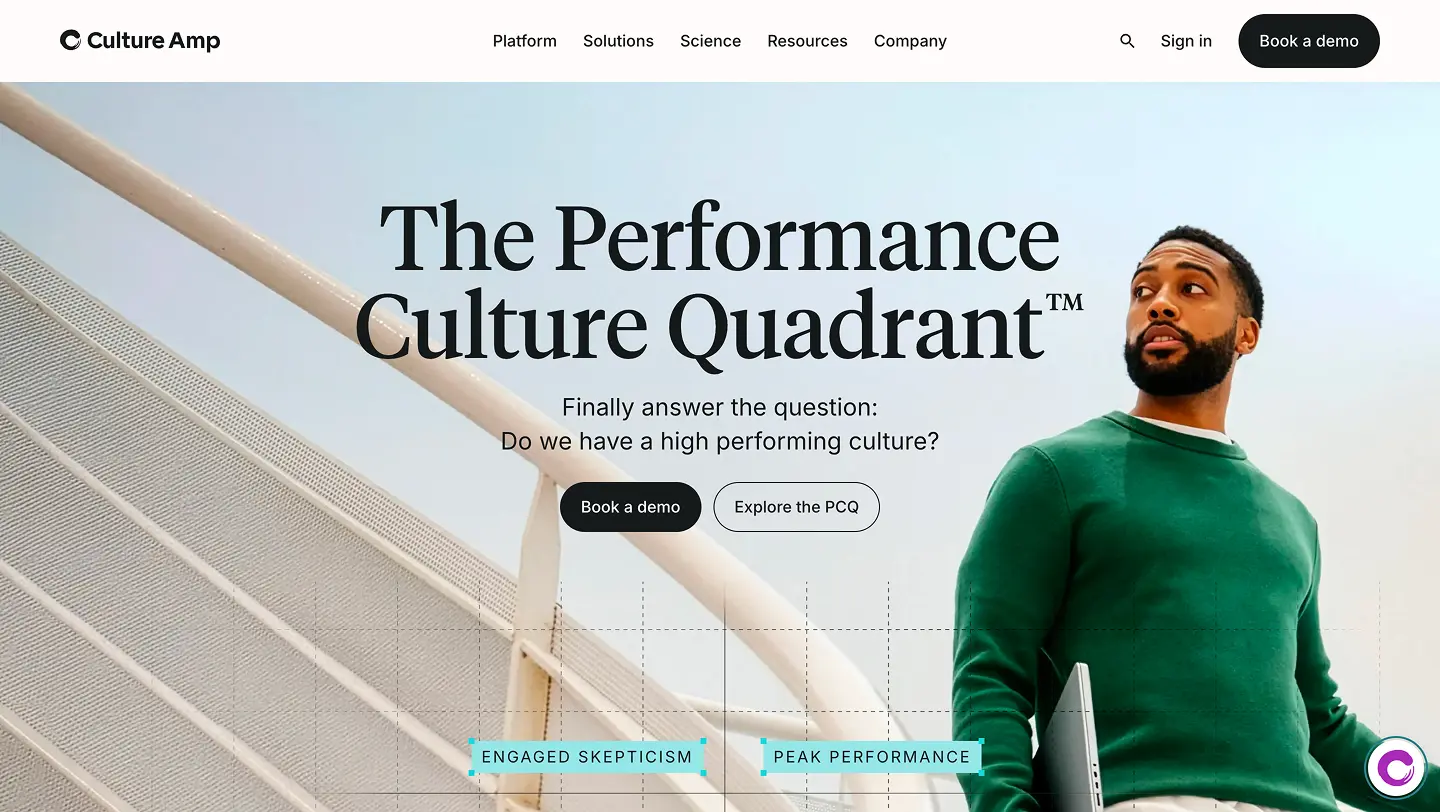
Visit website
Last updated 07/27/2026
#0: 0px
#1: 1px
#2: 2px
#4: 4px
#6: 6px
#none: 0px
#sm: 4px
#md: 7px
---
version: alpha
name: Kaizen Design System
description: Culture Amp's design system for building consistent, accessible, and delightful user experiences with React and TypeScript.
colors:
# Purple
purple-100: '#f4edf8'
purple-200: '#dfc9ea'
purple-300: '#c9a5dd'
purple-400: '#ae67b1'
purple-500: '#844587'
purple-600: '#5f3361'
purple-700: '#4a234d'
purple-800: '#2f2438'
# Blue
blue-100: '#e6f6ff'
blue-200: '#bde2f5'
blue-300: '#73c0e8'
blue-400: '#008bd6'
blue-500: '#0168b3'
blue-600: '#004970'
blue-700: '#003157'
# Green
green-100: '#e8f8f4'
green-200: '#c4ede2'
green-300: '#8fdbc7'
green-400: '#5dcaad'
green-500: '#3f9a86'
green-600: '#2c7d67'
green-700: '#22594a'
# Yellow
yellow-100: '#fff9e4'
yellow-200: '#ffeeb3'
yellow-300: '#ffe36e'
yellow-400: '#ffca4d'
yellow-500: '#ffb600'
yellow-600: '#c68600'
yellow-700: '#876400'
# Red
red-100: '#fdeaee'
red-200: '#f9c2cb'
red-300: '#f597a8'
red-400: '#e0707d'
red-500: '#c93b55'
red-600: '#a82433'
red-700: '#6c1e20'
# Orange
orange-100: '#fff0e8'
orange-200: '#ffd1b9'
orange-300: '#ffb08a'
orange-400: '#ff9461'
orange-500: '#e96c2f'
orange-600: '#b74302'
orange-700: '#903c00'
# Neutral Grays
gray-100: '#f9f9f9'
gray-200: '#f4f4f5'
gray-300: '#eaeaec'
gray-400: '#cdcdd0'
gray-500: '#878792'
gray-600: '#524e56'
# Base
white: '#ffffff'
black: '#000000'
# Data Visualization
data-viz-favorable: '#7dd5bd'
data-viz-unfavorable: '#e68d97'
# Semantic Colors
primary: '{colors.purple-500}'
primary-hover: '{colors.purple-600}'
primary-active: '{colors.purple-700}'
success: '{colors.green-500}'
success-light: '{colors.green-100}'
warning: '{colors.yellow-500}'
warning-light: '{colors.yellow-100}'
danger: '{colors.red-500}'
danger-light: '{colors.red-100}'
info: '{colors.blue-500}'
info-light: '{colors.blue-100}'
neutral: '{colors.gray-500}'
# Surface Colors
surface-primary: '{colors.white}'
surface-secondary: '{colors.gray-100}'
surface-tertiary: '{colors.gray-200}'
# Text Colors
text-primary: '{colors.gray-600}'
text-secondary: '{colors.gray-500}'
text-inverse: '{colors.white}'
# Border Colors
border-default: '#e1e2ea'
border-focus: '{colors.blue-500}'
typography:
# Display Typography (Tiempos Headline)
display-0:
fontFamily: '"Tiempos Headline", Georgia, serif'
fontSize: 72px
fontWeight: 800
lineHeight: 84px
letterSpacing: '0em'
# Headings (Inter)
heading-1:
fontFamily: '"Inter", "Noto Sans", Helvetica, Arial, sans-serif'
fontSize: 34px
fontWeight: 500
lineHeight: 42px
heading-2:
fontFamily: '"Inter", "Noto Sans", Helvetica, Arial, sans-serif'
fontSize: 28px
fontWeight: 600
lineHeight: 36px
heading-3:
fontFamily: '"Inter", "Noto Sans", Helvetica, Arial, sans-serif'
fontSize: 22px
fontWeight: 600
lineHeight: 30px
heading-4:
fontFamily: '"Inter", "Noto Sans", Helvetica, Arial, sans-serif'
fontSize: 18px
fontWeight: 600
lineHeight: 24px
heading-5:
fontFamily: '"Inter", "Noto Sans", Helvetica, Arial, sans-serif'
fontSize: 16px
fontWeight: 600
lineHeight: 24px
heading-6:
fontFamily: '"Inter", "Noto Sans", Helvetica, Arial, sans-serif'
fontSize: 14px
fontWeight: 600
lineHeight: 24px
# Body Text
body-large:
fontFamily: '"Inter", "Noto Sans", Helvetica, Arial, sans-serif'
fontSize: 20px
fontWeight: 400
lineHeight: 30px
body:
fontFamily: '"Inter", "Noto Sans", Helvetica, Arial, sans-serif'
fontSize: 16px
fontWeight: 400
lineHeight: 24px
body-small:
fontFamily: '"Inter", "Noto Sans", Helvetica, Arial, sans-serif'
fontSize: 14px
fontWeight: 400
lineHeight: 18px
body-extra-small:
fontFamily: '"Inter", "Noto Sans", Helvetica, Arial, sans-serif'
fontSize: 12px
fontWeight: 400
lineHeight: 18px
body-bold:
fontFamily: '"Inter", "Noto Sans", Helvetica, Arial, sans-serif'
fontSize: 16px
fontWeight: 600
lineHeight: 24px
# UI Elements
button-primary:
fontFamily: '"Inter", "Noto Sans", Helvetica, Arial, sans-serif'
fontSize: 18px
fontWeight: 500
lineHeight: 24px
button-secondary:
fontFamily: '"Inter", "Noto Sans", Helvetica, Arial, sans-serif'
fontSize: 16px
fontWeight: 500
lineHeight: 24px
label:
fontFamily: '"Inter", "Noto Sans", Helvetica, Arial, sans-serif'
fontSize: 14px
fontWeight: 600
lineHeight: 24px
rounded:
none: 0px
sm: 4px
md: 7px
lg: 10px
xl: 16px
full: 9999px
spacing:
0: 0px
1: 1px
2: 2px
4: 4px
6: 6px
8: 8px
12: 12px
16: 16px
20: 20px
24: 24px
32: 32px
40: 40px
48: 48px
56: 56px
64: 64px
72: 72px
80: 80px
96: 96px
112: 112px
128: 128px
160: 160px
200: 200px
240: 240px
280: 280px
320: 320px
# Semantic Spacing
xs: 6px
sm: 12px
md: 24px
lg: 36px
xl: 48px
xxl: 60px
xxxl: 72px
xxxxl: 84px
xxxxxl: 96px
components:
# Buttons
button-primary:
backgroundColor: '{colors.primary}'
textColor: '{colors.text-inverse}'
padding: '{spacing.12} {spacing.24}'
rounded: '{rounded.md}'
typography: '{typography.button-primary}'
button-primary-hover:
backgroundColor: '{colors.primary-hover}'
button-primary-active:
backgroundColor: '{colors.primary-active}'
button-primary-disabled:
backgroundColor: '{colors.gray-300}'
button-secondary:
backgroundColor: '{colors.surface-primary}'
textColor: '{colors.text-primary}'
padding: '{spacing.12} {spacing.24}'
rounded: '{rounded.md}'
typography: '{typography.button-secondary}'
button-secondary-hover:
textColor: '{colors.primary}'
button-secondary-active:
backgroundColor: '{colors.purple-100}'
button-secondary-disabled:
textColor: '{colors.gray-400}'
# Form Inputs
text-field:
backgroundColor: '{colors.surface-primary}'
textColor: '{colors.text-primary}'
padding: '{spacing.12} {spacing.16}'
rounded: '{rounded.md}'
typography: '{typography.body}'
text-field-disabled:
backgroundColor: '{colors.surface-tertiary}'
textColor: '{colors.gray-400}'
# Cards
card:
backgroundColor: '{colors.surface-primary}'
rounded: '{rounded.md}'
padding: '{spacing.24}'
# Tables
table:
backgroundColor: '{colors.surface-primary}'
rounded: '{rounded.md}'
table-header:
backgroundColor: '{colors.surface-secondary}'
typography: '{typography.label}'
padding: '{spacing.12} {spacing.16}'
table-cell:
padding: '{spacing.16}'
table-row-hover:
backgroundColor: '{colors.surface-secondary}'
# Modals
modal-overlay:
backgroundColor: 'rgba(0, 0, 0, 0.5)'
modal-container:
backgroundColor: '{colors.surface-primary}'
rounded: '{rounded.lg}'
padding: '{spacing.32}'
# Notifications
notification-success:
backgroundColor: '{colors.success-light}'
textColor: '{colors.success}'
rounded: '{rounded.md}'
padding: '{spacing.16}'
notification-error:
backgroundColor: '{colors.danger-light}'
textColor: '{colors.danger}'
rounded: '{rounded.md}'
padding: '{spacing.16}'
notification-warning:
backgroundColor: '{colors.warning-light}'
textColor: '{colors.warning}'
rounded: '{rounded.md}'
padding: '{spacing.16}'
notification-info:
backgroundColor: '{colors.info-light}'
textColor: '{colors.info}'
rounded: '{rounded.md}'
padding: '{spacing.16}'
# Navigation
tab:
padding: '{spacing.12} {spacing.16}'
typography: '{typography.button-secondary}'
textColor: '{colors.text-secondary}'
tab-hover:
textColor: '{colors.text-primary}'
tab-active:
textColor: '{colors.primary}'
# Badges
badge:
backgroundColor: '{colors.primary}'
textColor: '{colors.text-inverse}'
rounded: '{rounded.full}'
padding: '{spacing.2} {spacing.8}'
typography: '{typography.body-small}'
# Wells
well:
backgroundColor: '{colors.surface-secondary}'
rounded: '{rounded.md}'
padding: '{spacing.24}'
# Dividers
divider:
backgroundColor: '{colors.border-default}'
height: 1px
# Tooltips
tooltip:
backgroundColor: '{colors.gray-600}'
textColor: '{colors.text-inverse}'
rounded: '{rounded.sm}'
padding: '{spacing.8} {spacing.12}'
typography: '{typography.body-small}'
---
## Overview
Kaizen is Culture Amp's design system for building accessible, consistent React applications with TypeScript. All components are built on React Aria and follow WCAG 2.1 AA standards. The system uses CSS variables for themeable design tokens.
**Technology Stack:**
- React 18+
- TypeScript 5+
- React Aria (accessibility foundation)
- CSS Variables (token implementation)
**Philosophy:** Continuous improvement ("Kaizen") through iterative refinement, accessibility-first development, and composable component architecture.
---
## Colors
### Color System Architecture
The color system provides a hierarchical palette optimized for WCAG AA compliance. All colors are defined as hex values and exposed via CSS variables.
### Palette Structure
**Brand Colors:** Purple ({colors.purple-100} through {colors.purple-800}) serves as the primary brand hue.
**Semantic Colors:** Blue (info), Green (success), Yellow (warning), Red (danger), Orange (highlight).
**Neutral Colors:** Gray scale ({colors.gray-100} through {colors.gray-600}) for text, borders, and surfaces.
**Data Visualization:** {colors.data-viz-favorable} (#7dd5bd) and {colors.data-viz-unfavorable} (#e68d97) are colorblind-safe.
### Token Mapping
| Token | Value | Usage |
| -------------------------- | ------------------- | --------------------------------- |
| {colors.primary} | {colors.purple-500} | Primary actions, brand moments |
| {colors.success} | {colors.green-500} | Success states, positive feedback |
| {colors.warning} | {colors.yellow-500} | Warning states, cautionary UI |
| {colors.danger} | {colors.red-500} | Error states, destructive actions |
| {colors.info} | {colors.blue-500} | Informational states |
| {colors.text-primary} | {colors.gray-600} | Primary text content |
| {colors.text-secondary} | {colors.gray-500} | Secondary text content |
| {colors.text-inverse} | {colors.white} | Text on dark backgrounds |
| {colors.surface-primary} | {colors.white} | Primary surface background |
| {colors.surface-secondary} | {colors.gray-100} | Secondary surface background |
| {colors.border-default} | #e1e2ea | Default border color |
| {colors.border-focus} | {colors.blue-500} | Focus ring color |
### Contrast Requirements
All color combinations must meet WCAG AA standards:
- Normal text (< 18px): 4.5:1 minimum
- Large text (≥ 18px): 3:1 minimum
- UI components: 3:1 minimum
---
## Typography
### Type System Architecture
Kaizen implements a dual-typeface system with modular scale (1.25 ratio). All typography tokens include fontFamily, fontSize, fontWeight, lineHeight, and letterSpacing.
### Font Families
- **Inter**: UI components, body text, headings (sans-serif)
- **Tiempos Headline**: Display typography, brand moments (serif)
### Type Scale Tokens
| Token | Font Size | Line Height | Weight | Usage |
| ----------------------------- | --------- | ----------- | ------ | ----------------------------- |
| {typography.display-0} | 72px | 84px | 800 | Hero sections, large displays |
| {typography.heading-1} | 34px | 42px | 500 | Page titles (h1) |
| {typography.heading-2} | 28px | 36px | 600 | Major sections (h2) |
| {typography.heading-3} | 22px | 30px | 600 | Subsections (h3) |
| {typography.heading-4} | 18px | 24px | 600 | Minor headings (h4) |
| {typography.heading-5} | 16px | 24px | 600 | Small headings (h5) |
| {typography.heading-6} | 14px | 24px | 600 | Micro headings (h6) |
| {typography.body-large} | 20px | 30px | 400 | Lead paragraphs |
| {typography.body} | 16px | 24px | 400 | Body text (default) |
| {typography.body-small} | 14px | 18px | 400 | Supporting text |
| {typography.body-extra-small} | 12px | 18px | 400 | Captions, fine print |
| {typography.button-primary} | 18px | 24px | 500 | Primary button labels |
| {typography.button-secondary} | 16px | 24px | 500 | Secondary button labels |
| {typography.label} | 14px | 24px | 600 | Form labels |
### Accessibility Requirements
- Use single h1 per page
- Never skip heading levels
- Maintain 50-75 character line length for body text
- Use semantic `<strong>` for emphasis
---
## Layout
### Spacing System
Base-8 spacing scale provides consistent rhythm. All spacing tokens are unitless integers representing pixels.
### Spacing Tokens
| Token | Value (px) | Usage |
| ------------ | ---------- | ------------------------- |
| {spacing.0} | 0 | No spacing |
| {spacing.4} | 4 | Micro spacing |
| {spacing.8} | 8 | Tight spacing |
| {spacing.12} | 12 | Component internals |
| {spacing.16} | 16 | Default component spacing |
| {spacing.24} | 24 | Component padding |
| {spacing.32} | 32 | Section spacing |
| {spacing.48} | 48 | Large section spacing |
| {spacing.64} | 64 | Major layout divisions |
| {spacing.96} | 96 | Page-level spacing |
| {spacing.xs} | 6 | Extra small |
| {spacing.sm} | 12 | Small |
| {spacing.md} | 24 | Medium |
| {spacing.lg} | 36 | Large |
| {spacing.xl} | 48 | Extra large |
### Responsive Breakpoints
| Breakpoint | Min Width | Target Devices |
| ---------- | ---------------------------- | -------------- |
| Mobile | < 48em (768px) | Phones |
| Tablet | 48em - 64em (768px - 1024px) | Tablets |
| Desktop | > 64em (1024px+) | Desktops |
### Grid Model
- 12-column grid system
- Flexible gutters using {spacing} tokens
- Mobile-first responsive approach
---
## Elevation & Depth
### Z-Index Scale
| Level | Z-Index | Usage |
| ----- | ------- | ------------------------------- |
| 0 | 0 | Base layer |
| 1 | 1 | Elevated cards, sticky elements |
| 2 | 10 | Dropdowns, popovers |
| 3 | 100 | Navigation, fixed headers |
| 4 | 1000 | Modals, overlays |
| 5 | 10000 | Tooltips, critical overlays |
### Shadow Levels
- **Level 0**: No shadow (default)
- **Level 1**: Subtle shadow (cards at rest)
- **Level 2**: Medium shadow (dropdowns, popovers)
- **Level 3**: Strong shadow (modals, dialogs)
---
## Shapes
### Border Radius Scale
| Token | Value (px) | Usage |
| -------------- | ---------- | -------------------------------- |
| {rounded.none} | 0 | Sharp corners, data tables |
| {rounded.sm} | 4 | Small elements, tooltips |
| {rounded.md} | 7 | Default (buttons, inputs, cards) |
| {rounded.lg} | 10 | Focus rings, modals |
| {rounded.xl} | 16 | Large containers |
| {rounded.full} | 9999 | Pills, badges, avatars |
**Default:** Use {rounded.md} for all interactive components unless otherwise specified.
---
## Components
### Button
React component for user-triggered actions. Built on React Aria `<Button>`.
#### Base Styles
All button variants share these base properties:
- **Border Radius**: {rounded.md}
- **Cursor**: `pointer` (default), `not-allowed` (disabled)
- **Padding**: {spacing.12} {spacing.24} (vertical horizontal)
- **Transition**: 150ms ease-in-out (all properties)
- **Font Family**: {typography.button-primary.fontFamily} or {typography.button-secondary.fontFamily}
#### Variants
| Variant | `variant` Prop | Background | Text Color | Border | Usage Intent |
| --------- | -------------- | ------------------------ | --------------------- | --------------------------------- | ----------------------------------- |
| Primary | `"primary"` | {colors.primary} | {colors.text-inverse} | none | Main CTA, limit one per section |
| Secondary | `"secondary"` | {colors.surface-primary} | {colors.text-primary} | 2px solid {colors.border-default} | Secondary actions, multiple allowed |
| Tertiary | `"tertiary"` | transparent | {colors.text-primary} | none | Low-emphasis actions |
#### Size Variants
| Size | `size` Prop | Padding | Typography Token |
| ------ | -------------------- | ------------------------- | ----------------------------- |
| Small | `"small"` | {spacing.8} {spacing.16} | {typography.button-secondary} |
| Medium | `"medium"` (default) | {spacing.12} {spacing.24} | {typography.button-secondary} |
| Large | `"large"` | {spacing.16} {spacing.32} | {typography.button-primary} |
#### Interaction States
**Primary Variant:**
| State | Condition | Token Changes |
| -------- | ----------------------------- | ------------------------------------------------------------ |
| Default | - | backgroundColor: {colors.primary} |
| Hover | `:hover`, `isHovered={true}` | backgroundColor: {colors.primary-hover} |
| Active | `:active`, `isPressed={true}` | backgroundColor: {colors.primary-active} |
| Focus | `:focus-visible` | outline: 2px solid {colors.border-focus}, outlineOffset: 2px |
| Disabled | `isDisabled={true}` | backgroundColor: {colors.gray-300}, cursor: not-allowed |
**Secondary Variant:**
| State | Condition | Token Changes |
| -------- | ----------------------------- | ----------------------------------------------------------------------------- |
| Default | - | borderColor: {colors.border-default} |
| Hover | `:hover`, `isHovered={true}` | borderColor: {colors.primary}, color: {colors.primary} |
| Active | `:active`, `isPressed={true}` | backgroundColor: {colors.purple-100} |
| Focus | `:focus-visible` | outline: 2px solid {colors.border-focus}, outlineOffset: 2px |
| Disabled | `isDisabled={true}` | color: {colors.gray-400}, borderColor: {colors.gray-300}, cursor: not-allowed |
#### Props
- `variant`: `"primary" | "secondary" | "tertiary"`
- `size`: `"small" | "medium" | "large"`
- `isDisabled`: boolean
- `fullWidth`: boolean (stretch to 100% container width)
- `icon`: ReactNode (icon component)
- `iconPosition`: `"start" | "end"`
- `hasHiddenLabel`: boolean (for icon-only buttons with accessible label)
- `onPress`: (e: PressEvent) => void
---
### TextField
React component for single-line text input. Composed of Label, Input, and FieldGroup components.
#### Base Styles
- **Border Radius**: {rounded.md}
- **Border Width**: 2px
- **Typography**: {typography.body}
- **Padding**: {spacing.12} {spacing.16}
- **Transition**: border-color 150ms ease-in-out
#### Variants
| Variant | `reversed` Prop | Background | Border | Text Color | Usage Intent |
| -------- | --------------- | ------------------------ | ----------------------- | --------------------- | ---------------- |
| Default | `false` | {colors.surface-primary} | {colors.border-default} | {colors.text-primary} | Standard forms |
| Reversed | `true` | rgba(255,255,255,0.1) | rgba(255,255,255,0.3) | {colors.text-inverse} | Dark backgrounds |
#### Interaction States
| State | Condition | Token Changes |
| -------- | ------------------- | ----------------------------------------------------------------------------------------- |
| Default | - | borderColor: {colors.border-default} |
| Focus | `:focus-within` | borderColor: {colors.border-focus}, outline: none |
| Error | `isInvalid={true}` | borderColor: {colors.danger} |
| Disabled | `isDisabled={true}` | backgroundColor: {colors.surface-tertiary}, color: {colors.gray-400}, cursor: not-allowed |
#### Props
- `label`: string (required, visible label)
- `description`: string (helper text)
- `validationMessage`: string (error message, shown when `isInvalid={true}`)
- `value`: string
- `onChange`: (value: string) => void
- `type`: `"text" | "email" | "password" | "number" | "tel" | "url"`
- `isDisabled`: boolean
- `isRequired`: boolean
- `isInvalid`: boolean
- `reversed`: boolean
- `startIcon`: ReactNode
- `endIcon`: ReactNode
---
### Card
React component for grouping related content. Provides consistent spacing and border treatment.
#### Base Styles
- **Border Radius**: {rounded.md}
- **Border**: 2px solid {colors.border-default}
- **Background**: {colors.surface-primary}
- **Padding**: {spacing.24}
- **Transition**: border-color 150ms ease-in-out
#### Variants
| Variant | `variant` Prop | Background | Border | Usage Intent |
| -------- | -------------- | ------------------------ | ----------------------- | ------------- |
| Default | `"default"` | {colors.surface-primary} | {colors.border-default} | Standard card |
| Elevated | `"elevated"` | {colors.surface-primary} | none, shadow level 1 | Raised card |
| Outlined | `"outlined"` | transparent | {colors.border-default} | Subtle card |
#### Interaction States
| State | Condition | Token Changes |
| ------- | ------------------------------- | ------------------------------------------------------------ |
| Default | - | borderColor: {colors.border-default} |
| Hover | `isClickable={true}` + `:hover` | borderColor: {colors.gray-400} |
| Active | `isSelected={true}` | borderColor: {colors.primary} |
| Focus | `:focus-within` | outline: 2px solid {colors.border-focus}, outlineOffset: 2px |
#### Props
- `variant`: `"default" | "elevated" | "outlined"`
- `isClickable`: boolean (enables hover state)
- `isSelected`: boolean (active state)
- `padding`: `"none" | "compact" | "default" | "large"` (maps to {spacing.0}, {spacing.16}, {spacing.24}, {spacing.32})
---
### Table
React component for displaying structured tabular data. Composable with TableCard, TableContainer, TableHeader, TableHeaderRow, TableHeaderRowCell, TableRow, TableRowCell.
#### Base Styles
- **Border Radius**: {rounded.md} (container)
- **Border**: 2px solid {colors.border-default} (container)
- **Background**: {colors.surface-primary}
- **Cell Border**: 1px solid {colors.border-default} (bottom only)
#### Variants
| Variant | `variant` Prop | Row Padding | Typography | Usage Intent |
| ------- | -------------- | ------------ | ---------------------------------------- | ----------------- |
| Default | `"default"` | {spacing.16} | {typography.body} | Standard tables |
| Compact | `"compact"` | {spacing.8} | {typography.body-small} | Dense data tables |
| Data | `"data"` | {spacing.16} | {typography.body}, right-aligned numbers | Numerical data |
#### Component Structure
| Component | Background | Padding | Typography | Usage |
| ------------ | -------------------------- | ------------------------- | ------------------ | -------------- |
| TableHeader | {colors.surface-secondary} | {spacing.12} {spacing.16} | {typography.label} | Column headers |
| TableRow | {colors.surface-primary} | - | - | Data rows |
| TableRowCell | transparent | {spacing.16} | {typography.body} | Data cells |
#### Interaction States
**TableRow:**
| State | Condition | Token Changes |
| -------- | ------------------- | ------------------------------------------- |
| Default | - | backgroundColor: {colors.surface-primary} |
| Hover | `:hover` | backgroundColor: {colors.surface-secondary} |
| Selected | `isSelected={true}` | backgroundColor: {colors.purple-100} |
#### Props
**Table:**
- `variant`: `"default" | "compact" | "data"`
- `reversed`: boolean
**TableRow:**
- `isSelected`: boolean
- `isDisabled`: boolean
- `onRowClick`: () => void
**TableHeaderRowCell:**
- `sortable`: boolean
- `sortDirection`: `"asc" | "desc" | null`
- `onSort`: () => void
- `align`: `"left" | "center" | "right"`
---
### Modal
React component for focused dialogs. Traps focus, prevents body scroll, and dismisses on Escape key.
#### Base Styles
**Overlay:**
- **Background**: rgba(0, 0, 0, 0.5)
- **Z-Index**: 1000
- **Backdrop Filter**: blur(2px)
**Container:**
- **Background**: {colors.surface-primary}
- **Border Radius**: {rounded.lg}
- **Padding**: {spacing.32}
- **Max Width**: 600px
- **Box Shadow**: level 3
#### Variants
| Variant | `variant` Prop | Max Width | Padding | Usage Intent |
| ------------ | ---------------- | --------- | ------------ | --------------------------- |
| Generic | `"generic"` | 600px | {spacing.32} | Flexible content |
| Confirmation | `"confirmation"` | 480px | {spacing.24} | Confirm destructive actions |
| Input/Edit | `"input"` | 720px | {spacing.32} | Forms and data entry |
#### Interaction States
| State | Condition | Token Changes |
| ----- | ------------- | ------------------------------------------------------------------ |
| Enter | Animation in | opacity: 0 → 1, transform: scale(0.95) → scale(1), duration: 200ms |
| Exit | Animation out | opacity: 1 → 0, transform: scale(1) → scale(0.95), duration: 150ms |
#### Props
- `variant`: `"generic" | "confirmation" | "input"`
- `isOpen`: boolean (required)
- `onDismiss`: () => void (required)
- `title`: string
- `isDismissable`: boolean (default: true)
- `size`: `"small" | "medium" | "large"`
---
### Notification
React component for user feedback messages. Auto-dismissible with configurable duration.
#### Base Styles
- **Border Radius**: {rounded.md}
- **Border Width**: 2px
- **Padding**: {spacing.16}
- **Min Height**: 48px
- **Typography**: {typography.body}
#### Variants
| Variant | `variant` Prop | Background | Border Color | Text Color | Icon | Usage Intent |
| ------- | -------------- | ---------------------- | ---------------- | ---------------- | --------- | ---------------------- |
| Success | `"success"` | {colors.success-light} | {colors.success} | {colors.success} | checkmark | Success feedback |
| Error | `"error"` | {colors.danger-light} | {colors.danger} | {colors.danger} | error | Error feedback |
| Warning | `"warning"` | {colors.warning-light} | {colors.warning} | {colors.warning} | warning | Warning feedback |
| Info | `"info"` | {colors.info-light} | {colors.info} | {colors.info} | info | Informational feedback |
#### Interaction States
| State | Condition | Token Changes |
| ----- | ------------- | ----------------------------------------------------- |
| Enter | Animation in | opacity: 0 → 1, translateX: 100% → 0, duration: 300ms |
| Exit | Animation out | opacity: 1 → 0, translateX: 0 → 100%, duration: 200ms |
#### Props
- `variant`: `"success" | "error" | "warning" | "info"` (required)
- `title`: string
- `message`: string
- `onDismiss`: () => void
- `autoDismiss`: boolean (default: true for success/info, false for error/warning)
- `dismissDelay`: number (default: 5000ms)
- `action`: ReactNode (optional action button)
---
### Tabs
React component for tabbed navigation. Built on React Aria Tabs. Composed of Tabs (container), TabList, and Tab components.
#### Base Styles
**TabList:**
- **Display**: flex
- **Gap**: {spacing.4}
- **Border Bottom**: 1px solid {colors.border-default}
**Tab:**
- **Padding**: {spacing.12} {spacing.16}
- **Typography**: {typography.button-secondary}
- **Border Bottom**: 2px solid transparent
- **Transition**: all 150ms ease-in-out
#### Interaction States
**Tab:**
| State | Condition | Token Changes |
| -------- | ------------------- | -------------------------------------------------------------- |
| Default | - | color: {colors.text-secondary}, borderBottomColor: transparent |
| Hover | `:hover` | color: {colors.text-primary} |
| Selected | `isSelected={true}` | color: {colors.primary}, borderBottomColor: {colors.primary} |
| Focus | `:focus-visible` | outline: 2px solid {colors.border-focus}, outlineOffset: 2px |
| Disabled | `isDisabled={true}` | color: {colors.gray-400}, cursor: not-allowed |
#### Props
**Tabs:**
- `selectedKey`: string
- `onSelectionChange`: (key: string) => void
- `children`: ReactNode (TabList and TabPanel components)
**Tab:**
- `id`: string (required)
- `isDisabled`: boolean
- `children`: ReactNode (tab label)
---
### Badge
React component for count indicators and status dots.
#### Base Styles
- **Border Radius**: {rounded.full}
- **Typography**: {typography.body-small}
- **Padding**: {spacing.2} {spacing.8}
- **Min Width**: 20px
- **Text Align**: center
#### Variants
| Variant | `variant` Prop | Background | Text Color | Usage Intent |
| ------- | -------------- | ---------------- | --------------------- | ----------------- |
| Primary | `"primary"` | {colors.primary} | {colors.text-inverse} | Default badge |
| Success | `"success"` | {colors.success} | {colors.text-inverse} | Success indicator |
| Warning | `"warning"` | {colors.warning} | {colors.text-primary} | Warning indicator |
| Danger | `"danger"` | {colors.danger} | {colors.text-inverse} | Error indicator |
| Neutral | `"neutral"` | {colors.neutral} | {colors.text-inverse} | Neutral indicator |
#### Props
- `variant`: `"primary" | "success" | "warning" | "danger" | "neutral"`
- `count`: number (displays count, hides if 0)
- `showZero`: boolean (show badge when count is 0)
- `max`: number (displays "max+" when count exceeds, default: 99)
---
### Well
React component for grouping related content with distinct background.
#### Base Styles
- **Border Radius**: {rounded.md}
- **Border**: 2px solid {colors.border-default}
- **Background**: {colors.surface-secondary}
- **Padding**: {spacing.24}
#### Variants
| Variant | `variant` Prop | Background | Border | Usage Intent |
| -------- | -------------- | -------------------------- | ----------------------- | ------------------ |
| Default | `"default"` | {colors.surface-secondary} | {colors.border-default} | General grouping |
| Outlined | `"outlined"` | transparent | {colors.border-default} | Subtle grouping |
| Filled | `"filled"` | {colors.surface-secondary} | none | Prominent grouping |
#### Props
- `variant`: `"default" | "outlined" | "filled"`
- `noMargin`: boolean (removes default margins)
- `isLoading`: boolean (shows AI loading state)
- `borderStyle`: `"solid" | "dashed" | "borderless"`
---
### Tooltip
React component for contextual information on hover/focus. Limited screen reader support.
#### Base Styles
- **Border Radius**: {rounded.sm}
- **Background**: {colors.gray-600}
- **Color**: {colors.text-inverse}
- **Padding**: {spacing.8} {spacing.12}
- **Typography**: {typography.body-small}
- **Max Width**: 250px
- **Z-Index**: 10000
- **Box Shadow**: level 2
#### Interaction States
| State | Condition | Token Changes |
| ------- | ------------------------------- | -------------------------------------------------- |
| Hidden | Default | opacity: 0, visibility: hidden |
| Visible | `:hover` or `:focus` on trigger | opacity: 1, visibility: visible, transition: 150ms |
#### Props
- `text`: string (required)
- `placement`: `"top" | "right" | "bottom" | "left"`
- `delay`: number (default: 300ms)
**Accessibility Warning:** Use sparingly. Never place critical information in tooltips. Screen reader support is limited.
---
### Checkbox
React component for binary choice selection. Built on React Aria Checkbox.
#### Base Styles
- **Size**: 20x20px
- **Border**: 2px solid {colors.border-default}
- **Border Radius**: {rounded.sm}
- **Transition**: all 150ms ease-in-out
#### Interaction States
| State | Condition | Token Changes |
| ------------- | ------------------------ | --------------------------------------------------------------------------------------------- |
| Unchecked | `isSelected={false}` | borderColor: {colors.border-default}, background: transparent |
| Checked | `isSelected={true}` | borderColor: {colors.primary}, background: {colors.primary}, checkmark: {colors.text-inverse} |
| Hover | `:hover` | borderColor: {colors.primary} |
| Focus | `:focus-visible` | outline: 2px solid {colors.border-focus}, outlineOffset: 2px |
| Disabled | `isDisabled={true}` | borderColor: {colors.gray-300}, background: {colors.surface-tertiary}, cursor: not-allowed |
| Indeterminate | `isIndeterminate={true}` | borderColor: {colors.primary}, background: {colors.primary}, dash: {colors.text-inverse} |
#### Props
- `isSelected`: boolean
- `isDisabled`: boolean
- `isIndeterminate`: boolean
- `onChange`: (isSelected: boolean) => void
- `children`: ReactNode (label text)
---
### Radio
React component for mutually exclusive selection. Always used within RadioGroup.
#### Base Styles
- **Size**: 20x20px
- **Border**: 2px solid {colors.border-default}
- **Border Radius**: {rounded.full}
- **Transition**: all 150ms ease-in-out
#### Interaction States
| State | Condition | Token Changes |
| ---------- | -------------------- | ------------------------------------------------------------------------- |
| Unselected | `isSelected={false}` | borderColor: {colors.border-default}, background: transparent |
| Selected | `isSelected={true}` | borderColor: {colors.primary}, inner-dot: {colors.primary} (8px diameter) |
| Hover | `:hover` | borderColor: {colors.primary} |
| Focus | `:focus-visible` | outline: 2px solid {colors.border-focus}, outlineOffset: 2px |
| Disabled | `isDisabled={true}` | borderColor: {colors.gray-300}, cursor: not-allowed |
#### Props
**Radio:**
- `value`: string (required)
- `isDisabled`: boolean
- `children`: ReactNode (label text)
**RadioGroup:**
- `label`: string (required, group label)
- `value`: string (selected value)
- `onChange`: (value: string) => void
- `isDisabled`: boolean
- `orientation`: `"horizontal" | "vertical"`
---
### ToggleSwitch
React component for on/off state toggle. Built on React Aria Switch.
#### Base Styles
- **Track Width**: 44px
- **Track Height**: 24px
- **Border Radius**: {rounded.full}
- **Thumb Size**: 18x18px
- **Transition**: all 200ms ease-in-out
#### Interaction States
| State | Condition | Token Changes |
| ----------- | -------------------- | ------------------------------------------------------------ |
| Off | `isSelected={false}` | track background: {colors.gray-400}, thumb translateX: 2px |
| On | `isSelected={true}` | track background: {colors.primary}, thumb translateX: 22px |
| Hover (Off) | `:hover` + off | track background: {colors.gray-500} |
| Hover (On) | `:hover` + on | track background: {colors.primary-hover} |
| Focus | `:focus-visible` | outline: 2px solid {colors.border-focus}, outlineOffset: 2px |
| Disabled | `isDisabled={true}` | track background: {colors.gray-300}, cursor: not-allowed |
#### Props
- `isSelected`: boolean
- `isDisabled`: boolean
- `onChange`: (isSelected: boolean) => void
- `children`: ReactNode (label text)
---
### Select
React component for dropdown selection with search. For simpler dropdowns, use SingleSelect.
#### Base Styles
- **Border Radius**: {rounded.md}
- **Border**: 2px solid {colors.border-default}
- **Padding**: {spacing.12} {spacing.16}
- **Typography**: {typography.body}
- **Min Height**: 44px
#### Variants
| Variant | `variant` Prop | Background | Border | Usage Intent |
| ---------- | -------------- | ------------------------ | ----------------------- | ------------------------------ |
| Default | `"default"` | {colors.surface-primary} | {colors.border-default} | Standard select |
| Searchable | `"searchable"` | {colors.surface-primary} | {colors.border-default} | Large option lists with search |
#### Interaction States
| State | Condition | Token Changes |
| -------- | ------------------- | ---------------------------------------------------------- |
| Default | - | borderColor: {colors.border-default} |
| Focus | `:focus-within` | borderColor: {colors.border-focus} |
| Open | `isOpen={true}` | borderColor: {colors.border-focus} |
| Error | `isInvalid={true}` | borderColor: {colors.danger} |
| Disabled | `isDisabled={true}` | background: {colors.surface-tertiary}, cursor: not-allowed |
#### Props
- `label`: string
- `selectedKey`: string | null
- `onSelectionChange`: (key: string) => void
- `isDisabled`: boolean
- `isInvalid`: boolean
- `placeholder`: string
- `description`: string
- `validationMessage`: string
---
### SingleSelect
React component for simple dropdown selection. Built on React Aria Select.
#### Base Styles
- **Border Radius**: {rounded.md}
- **Border**: 2px solid {colors.border-default}
- **Padding**: {spacing.12} {spacing.16}
- **Typography**: {typography.body}
- **Min Height**: 44px
#### Interaction States
| State | Condition | Token Changes |
| -------- | ------------------- | ---------------------------------------------------------- |
| Default | - | borderColor: {colors.border-default} |
| Focus | `:focus-visible` | borderColor: {colors.border-focus} |
| Open | `isOpen={true}` | borderColor: {colors.border-focus} |
| Error | `isInvalid={true}` | borderColor: {colors.danger} |
| Disabled | `isDisabled={true}` | background: {colors.surface-tertiary}, cursor: not-allowed |
#### Props
- `label`: string (required)
- `selectedKey`: string | null
- `onSelectionChange`: (key: string) => void
- `isDisabled`: boolean
- `isInvalid`: boolean
- `fullWidth`: boolean
- `reversed`: boolean
- `children`: ReactNode (MenuItem components)
---
### MultiSelect
React component for multiple selection from list.
#### Base Styles
- **Border Radius**: {rounded.md}
- **Border**: 2px solid {colors.border-default}
- **Padding**: {spacing.8}
- **Typography**: {typography.body}
- **Min Height**: 44px
#### Interaction States
| State | Condition | Token Changes |
| -------- | ------------------- | ---------------------------------------------------------- |
| Default | - | borderColor: {colors.border-default} |
| Focus | `:focus-within` | borderColor: {colors.border-focus} |
| Error | `isInvalid={true}` | borderColor: {colors.danger} |
| Disabled | `isDisabled={true}` | background: {colors.surface-tertiary}, cursor: not-allowed |
#### Props
- `label`: string
- `selectedKeys`: Set<string>
- `onSelectionChange`: (keys: Set<string>) => void
- `isDisabled`: boolean
- `isInvalid`: boolean
---
### TextAreaField
React component for multi-line text input. Composed of Label, TextArea, and FieldGroup.
#### Base Styles
- **Border Radius**: {rounded.md}
- **Border**: 2px solid {colors.border-default}
- **Padding**: {spacing.12} {spacing.16}
- **Typography**: {typography.body}
- **Min Height**: 96px
- **Resize**: vertical
#### Interaction States
| State | Condition | Token Changes |
| -------- | ------------------- | ---------------------------------------------------------- |
| Default | - | borderColor: {colors.border-default} |
| Focus | `:focus-within` | borderColor: {colors.border-focus} |
| Error | `isInvalid={true}` | borderColor: {colors.danger} |
| Disabled | `isDisabled={true}` | background: {colors.surface-tertiary}, cursor: not-allowed |
#### Props
- `label`: string (required)
- `description`: string
- `validationMessage`: string
- `value`: string
- `onChange`: (value: string) => void
- `rows`: number (default: 4)
- `isDisabled`: boolean
- `isRequired`: boolean
- `isInvalid`: boolean
- `reversed`: boolean
---
### SearchField
React component for search input with clear action.
#### Base Styles
- **Border Radius**: {rounded.md}
- **Border**: 2px solid {colors.border-default}
- **Padding**: {spacing.12} {spacing.16} {spacing.12} {spacing.40}
- **Typography**: {typography.body}
- **Search Icon**: positioned at {spacing.12} from left
#### Variants
| Variant | `variant` Prop | Border | Icon Color | Usage Intent |
| --------- | -------------- | ----------------------- | ----------------------- | ---------------- |
| Primary | `"primary"` | {colors.border-default} | {colors.text-secondary} | Prominent search |
| Secondary | `"secondary"` | {colors.gray-300} | {colors.text-secondary} | Inline filtering |
#### Interaction States
| State | Condition | Token Changes |
| -------- | ------------------- | ---------------------------------------------------------- |
| Default | - | borderColor: {colors.border-default} |
| Focus | `:focus-within` | borderColor: {colors.border-focus} |
| Disabled | `isDisabled={true}` | background: {colors.surface-tertiary}, cursor: not-allowed |
#### Props
- `value`: string
- `onChange`: (value: string) => void
- `onClear`: () => void
- `placeholder`: string
- `isDisabled`: boolean
- `variant`: `"primary" | "secondary"`
- `reversed`: boolean
---
### DatePicker
React component for date selection with calendar popup. Built on React Aria DatePicker.
#### Base Styles
- **Border Radius**: {rounded.md}
- **Border**: 2px solid {colors.border-default}
- **Padding**: {spacing.12} {spacing.16}
- **Typography**: {typography.body}
#### Interaction States
| State | Condition | Token Changes |
| -------- | ------------------- | ---------------------------------------------------------- |
| Default | - | borderColor: {colors.border-default} |
| Focus | `:focus-within` | borderColor: {colors.border-focus} |
| Open | `isOpen={true}` | borderColor: {colors.border-focus} |
| Error | `isInvalid={true}` | borderColor: {colors.danger} |
| Disabled | `isDisabled={true}` | background: {colors.surface-tertiary}, cursor: not-allowed |
#### Props
- `label`: string
- `value`: DateValue | null
- `onChange`: (date: DateValue) => void
- `minValue`: DateValue
- `maxValue`: DateValue
- `isDisabled`: boolean
- `isInvalid`: boolean
- `isRequired`: boolean
- `granularity`: `"day" | "hour" | "minute" | "second"`
---
### DateRangePicker
React component for selecting date ranges.
#### Base Styles
Same as DatePicker, but displays two date inputs (start and end).
#### Props
- `label`: string
- `value`: DateRangeValue | null
- `onChange`: (range: DateRangeValue) => void
- `minValue`: DateValue
- `maxValue`: DateValue
- `isDisabled`: boolean
- `isInvalid`: boolean
- `isRequired`: boolean
---
### Slider
React component for selecting numeric value from range. Built on React Aria Slider.
#### Base Styles
- **Track Height**: 4px
- **Track Background**: {colors.gray-300}
- **Track Border Radius**: {rounded.full}
- **Thumb Size**: 20x20px
- **Thumb Background**: {colors.primary}
- **Thumb Border Radius**: {rounded.full}
#### Interaction States
| State | Condition | Token Changes |
| -------- | ------------------- | ----------------------------------------------------------------------- |
| Default | - | track: {colors.gray-300}, thumb: {colors.primary} |
| Hover | `:hover` | thumb: {colors.primary-hover} |
| Focus | `:focus-visible` | thumb outline: 2px solid {colors.border-focus}, outlineOffset: 2px |
| Dragging | `isDragging={true}` | thumb: {colors.primary-active}, thumb scale: 1.1 |
| Disabled | `isDisabled={true}` | track: {colors.gray-200}, thumb: {colors.gray-400}, cursor: not-allowed |
#### Props
- `label`: string
- `value`: number
- `onChange`: (value: number) => void
- `minValue`: number
- `maxValue`: number
- `step`: number
- `isDisabled`: boolean
- `showMinMaxLabels`: boolean
- `labelPosition`: `"top" | "side"`
---
### Menu
React component for action menus triggered by button. Built on React Aria Menu.
#### Base Styles
**MenuPopover:**
- **Border Radius**: {rounded.md}
- **Border**: 2px solid {colors.border-default}
- **Background**: {colors.surface-primary}
- **Padding**: {spacing.8}
- **Box Shadow**: level 2
- **Z-Index**: 10
**MenuItem:**
- **Padding**: {spacing.12} {spacing.16}
- **Border Radius**: {rounded.sm}
- **Typography**: {typography.body}
- **Min Height**: 40px
#### Interaction States
**MenuItem:**
| State | Condition | Token Changes |
| -------- | ---------------------------- | ----------------------------------------------------- |
| Default | - | background: transparent, color: {colors.text-primary} |
| Hover | `:hover`, `isFocused={true}` | background: {colors.surface-secondary} |
| Active | `isPressed={true}` | background: {colors.purple-100} |
| Disabled | `isDisabled={true}` | color: {colors.gray-400}, cursor: not-allowed |
#### Props
**MenuTrigger:**
- `children`: [Button, MenuPopover]
**MenuItem:**
- `onAction`: () => void
- `isDisabled`: boolean
- `children`: ReactNode
**MenuSection:**
- `title`: string
- `children`: ReactNode (MenuItems)
---
### Popover
React component for non-modal contextual overlays. Use sparingly.
#### Base Styles
- **Border Radius**: {rounded.md}
- **Border**: 2px solid {colors.border-default}
- **Background**: {colors.surface-primary}
- **Padding**: {spacing.16}
- **Box Shadow**: level 2
- **Z-Index**: 10
- **Max Width**: 400px
#### Interaction States
| State | Condition | Token Changes |
| ------- | ---------------- | ------------------------------------------------ |
| Closed | `isOpen={false}` | display: none |
| Opening | Animation in | opacity: 0 → 1, scale: 0.95 → 1, duration: 150ms |
| Open | `isOpen={true}` | opacity: 1 |
| Closing | Animation out | opacity: 1 → 0, duration: 100ms |
#### Props
- `isOpen`: boolean
- `onClose`: () => void
- `triggerRef`: RefObject
- `placement`: `"top" | "right" | "bottom" | "left"`
- `offset`: number (default: 8)
---
### Heading
React component for semantic headings with visual styling.
#### Base Styles
Typography tokens are applied based on variant. Semantic HTML tag (h1-h6) should match visual hierarchy.
#### Variants
| Variant | `variant` Prop | Typography Token | Semantic Tag |
| --------- | -------------- | ---------------------- | ------------ |
| Display | `"display-0"` | {typography.display-0} | h1 |
| Heading 1 | `"heading-1"` | {typography.heading-1} | h1 |
| Heading 2 | `"heading-2"` | {typography.heading-2} | h2 |
| Heading 3 | `"heading-3"` | {typography.heading-3} | h3 |
| Heading 4 | `"heading-4"` | {typography.heading-4} | h4 |
| Heading 5 | `"heading-5"` | {typography.heading-5} | h5 |
| Heading 6 | `"heading-6"` | {typography.heading-6} | h6 |
#### Props
- `variant`: `"display-0" | "heading-1" | "heading-2" | "heading-3" | "heading-4" | "heading-5" | "heading-6"`
- `tag`: `"h1" | "h2" | "h3" | "h4" | "h5" | "h6"` (override semantic tag)
- `children`: ReactNode
**Accessibility:** Use `tag` prop when visual hierarchy doesn't match semantic hierarchy. Never skip heading levels.
---
### Text
React component for body text and paragraphs.
#### Base Styles
Typography tokens applied based on variant. Default max-width constraints prevent overly long line lengths.
#### Variants
| Variant | `variant` Prop | Typography Token | Max Width |
| ----------- | ------------------ | ----------------------------- | --------- |
| Large | `"large"` | {typography.body-large} | 975px |
| Body | `"body"` (default) | {typography.body} | 780px |
| Small | `"small"` | {typography.body-small} | 680px |
| Extra Small | `"extra-small"` | {typography.body-extra-small} | 600px |
#### Props
- `variant`: `"large" | "body" | "small" | "extra-small"`
- `tag`: `"p" | "span" | "div"`
- `children`: ReactNode
---
### Label
React component for form labels. Used internally by field components.
#### Base Styles
- **Typography**: {typography.label}
- **Color**: {colors.text-primary}
- **Margin Bottom**: {spacing.8}
#### Variants
| Variant | `variant` Prop | Font Weight | Color | Usage Intent |
| -------------- | ------------------ | ----------- | --------------------- | ----------------- |
| Default | `"default"` | 600 | {colors.text-primary} | Standard labels |
| Prominent | `"prominent"` | 600 | {colors.text-primary} | Emphasized labels |
| Checkbox/Radio | `"checkbox-radio"` | 400 | {colors.text-primary} | Choice labels |
#### Props
- `variant`: `"default" | "prominent" | "checkbox-radio"`
- `isDisabled`: boolean
- `isRequired`: boolean
- `reversed`: boolean
- `children`: ReactNode
---
### Icon
React component for Material Symbols icons loaded via CDN.
#### Base Styles
- **Size**: 24x24px (default, configurable via CSS variable)
- **Color**: currentColor (inherits from parent)
- **Font Family**: Material Symbols Outlined
- **Display**: inline-flex
#### Variants
| Variant | `filled` Prop | Icon Style | Usage Intent |
| -------- | ----------------- | -------------- | ------------------------- |
| Outlined | `false` (default) | Outlined style | Default icons |
| Filled | `true` | Filled style | Selected states, emphasis |
#### Props
- `name`: string (required, Material Symbol name)
- `filled`: boolean
- `isMeaningful`: boolean (if true, icon is announced to screen readers)
- `aria-label`: string (required when `isMeaningful={true}`)
**Accessibility:** Set `isMeaningful={false}` for decorative icons. Provide `aria-label` for meaningful icons.
---
### Avatar
React component for user or entity representation.
#### Base Styles
- **Border Radius**: {rounded.full}
- **Border**: 2px solid {colors.border-default}
- **Background**: {colors.primary} (when no image)
- **Typography**: {typography.body-bold}
- **Color**: {colors.text-inverse} (initials)
#### Size Variants
| Size | `size` Prop | Dimensions | Typography |
| ------ | -------------------- | ---------- | ----------------------------- |
| Small | `"small"` | 24x24px | {typography.body-extra-small} |
| Medium | `"medium"` (default) | 40x40px | {typography.body} |
| Large | `"large"` | 64x64px | {typography.heading-4} |
#### Props
- `fullName`: string (required for initials)
- `avatarSrc`: string (image URL)
- `size`: `"small" | "medium" | "large"`
- `isDisabled`: boolean
---
### AvatarGroup
React component for displaying multiple avatars with overlap.
#### Base Styles
Avatars overlap by 8px (negative margin).
#### Props
- `maxVisible`: number (default: 3, show "+N" for overflow)
- `size`: `"small" | "medium" | "large"`
- `children`: ReactNode (Avatar components)
---
### ProgressBar
React component for determinate progress indication.
#### Base Styles
- **Height**: 8px
- **Border Radius**: {rounded.full}
- **Background**: {colors.gray-300}
- **Fill Border Radius**: {rounded.full}
#### Variants
| Variant | `variant` Prop | Fill Color | Usage Intent |
| ------- | -------------- | ---------------- | --------------------- |
| Default | `"default"` | {colors.primary} | General progress |
| Success | `"success"` | {colors.success} | Successful completion |
| Warning | `"warning"` | {colors.warning} | Warning threshold |
| Danger | `"danger"` | {colors.danger} | Critical threshold |
#### Props
- `value`: number (current progress)
- `maxValue`: number (default: 100)
- `variant`: `"default" | "success" | "warning" | "danger"`
- `isAnimating`: boolean
- `label`: string (accessible label)
---
### Loading
React component for indeterminate loading state.
#### Base Styles
- **Size**: 40x40px (default)
- **Color**: {colors.primary}
- **Animation**: rotate 1s linear infinite
#### Size Variants
| Size | `size` Prop | Dimensions |
| ------ | ----------- | ---------- |
| Small | `"small"` | 24x24px |
| Medium | `"medium"` | 40x40px |
| Large | `"large"` | 64x64px |
#### Props
- `size`: `"small" | "medium" | "large"`
- `label`: string (accessible label, default: "Loading")
---
### Divider
React component for visual content separation.
#### Base Styles
- **Height**: 1px (horizontal), **Width**: 1px (vertical)
- **Background**: {colors.border-default}
- **Margin**: {spacing.24} 0 (horizontal), 0 {spacing.24} (vertical)
#### Props
- `orientation`: `"horizontal" | "vertical"`
- `spacing`: `"none" | "small" | "medium" | "large"` (margin override)
---
### Collapsible
React component for expandable/collapsible content.
#### Base Styles
- **Border Radius**: {rounded.md}
- **Transition**: height 200ms ease-in-out
#### Interaction States
| State | Condition | Token Changes |
| ---------- | ---------------- | --------------------------- |
| Collapsed | `isOpen={false}` | height: 0, overflow: hidden |
| Expanding | Animation | height: 0 → auto |
| Expanded | `isOpen={true}` | height: auto |
| Collapsing | Animation | height: auto → 0 |
#### Props
- `title`: string (required)
- `isOpen`: boolean
- `onToggle`: (isOpen: boolean) => void
- `children`: ReactNode
---
### Pagination
React component for page navigation controls.
#### Base Styles
- **Button Size**: 40x40px
- **Button Border Radius**: {rounded.md}
- **Gap**: {spacing.8}
#### Interaction States
**Page Button:**
| State | Condition | Token Changes |
| -------- | ------------------- | ---------------------------------------------------------- |
| Default | - | background: transparent, color: {colors.text-primary} |
| Hover | `:hover` | background: {colors.surface-secondary} |
| Active | `isCurrent={true}` | background: {colors.primary}, color: {colors.text-inverse} |
| Disabled | `isDisabled={true}` | color: {colors.gray-400}, cursor: not-allowed |
#### Props
- `currentPage`: number (required)
- `totalPages`: number (required)
- `onPageChange`: (page: number) => void
- `pageSize`: number
- `siblingCount`: number (pages shown around current)
---
### EmptyState
React component for communicating no content with suggested actions.
#### Base Styles
- **Padding**: {spacing.48}
- **Text Align**: center
- **Max Width**: 480px
#### Props
- `heading`: string (required)
- `description`: string
- `illustration`: ReactNode
- `action`: ReactNode (Button or LinkButton)
---
### GuidanceBlock
React component for prominent user guidance with actions.
#### Base Styles
- **Border Radius**: {rounded.md}
- **Background**: {colors.surface-secondary}
- **Padding**: {spacing.24}
- **Border**: 2px solid {colors.border-default}
#### Variants
| Variant | `variant` Prop | Background | Border | Usage Intent |
| --------- | -------------- | -------------------------- | ----------------------- | ------------------ |
| Default | `"default"` | {colors.surface-secondary} | {colors.border-default} | General guidance |
| Prominent | `"prominent"` | {colors.purple-100} | {colors.primary} | Important guidance |
#### Props
- `variant`: `"default" | "prominent"`
- `heading`: string
- `description`: string
- `illustration`: ReactNode
- `actions`: ReactNode (Button or LinkButton)
- `stacked`: boolean (vertical layout)
---
### Link
React component for text links and navigation.
#### Base Styles
- **Typography**: {typography.body}
- **Color**: {colors.primary}
- **Text Decoration**: underline
- **Transition**: color 150ms ease-in-out
#### Interaction States
| State | Condition | Token Changes |
| ------- | ---------------- | ------------------------------------------------------------ |
| Default | - | color: {colors.primary} |
| Hover | `:hover` | color: {colors.primary-hover} |
| Active | `:active` | color: {colors.primary-active} |
| Focus | `:focus-visible` | outline: 2px solid {colors.border-focus}, outlineOffset: 2px |
| Visited | `:visited` | color: {colors.purple-600} |
#### Props
- `href`: string
- `target`: `"_self" | "_blank"`
- `children`: ReactNode
---
### LinkButton
React component for button-styled links. Same visual appearance as Button but uses `<a>` tag.
#### Base Styles
Same as Button component.
#### Props
Same as Button, plus:
- `href`: string (required)
- `target`: `"_self" | "_blank"`
- `download`: string | boolean
---
### ButtonGroup
React component for grouping related buttons with consistent spacing.
#### Base Styles
- **Display**: flex
- **Gap**: {spacing.12}
- **Align Items**: center
#### Props
- `children`: ReactNode (Button or LinkButton components)
- `orientation`: `"horizontal" | "vertical"`
---
### Container
React component for constraining content width with responsive behavior.
#### Base Styles
- **Max Width**: varies by size
- **Padding**: {spacing.24} (mobile), {spacing.32} (tablet+)
- **Margin**: 0 auto (center alignment)
#### Size Variants
| Size | `size` Prop | Max Width | Usage Intent |
| ------- | ----------- | --------- | ---------------------- |
| Narrow | `"narrow"` | 640px | Forms, focused content |
| Default | `"default"` | 1024px | Standard pages |
| Wide | `"wide"` | 1280px | Data-heavy pages |
| Full | `"full"` | 100% | Application layouts |
#### Props
- `size`: `"narrow" | "default" | "wide" | "full"`
---
### Tile
React component for grid-based card layouts.
#### Base Styles
Same as Card, optimized for grid display.
#### Props
Same as Card component.
---
### TitleBlock
React component for page headers with actions and navigation.
#### Base Styles
- **Padding**: {spacing.24} 0
- **Border Bottom**: 1px solid {colors.border-default}
#### Props
- `title`: string (required)
- `breadcrumb`: ReactNode
- `avatar`: ReactNode
- `primaryAction`: ReactNode (Button)
- `secondaryAction`: ReactNode (Button)
- `overflowActions`: ReactNode (MenuTrigger)
- `navigationTabs`: ReactNode (Tabs)
---
### FieldMessage
React component for form field descriptions and validation messages.
#### Base Styles
- **Typography**: {typography.body-small}
- **Margin Top**: {spacing.8}
#### Variants
| Variant | `variant` Prop | Color | Icon | Usage Intent |
| ----------- | --------------- | ----------------------- | ---------- | -------------- |
| Description | `"description"` | {colors.text-secondary} | none | Helper text |
| Validation | `"validation"` | {colors.danger} | error icon | Error messages |
#### Props
- `variant`: `"description" | "validation"`
- `message`: string
- `reversed`: boolean
---
### FieldGroup
React component for grouping form field elements. Used internally by TextField, TextAreaField, etc.
#### Base Styles
- **Display**: flex
- **Flex Direction**: column
- **Gap**: {spacing.8}
#### Props
- `children`: ReactNode (Label, Input, FieldMessage)
- `inline`: boolean (horizontal layout for checkboxes/radios)
---
### VisuallyHidden
React component for hiding content visually while keeping it accessible to screen readers.
#### Base Styles
- **Position**: absolute
- **Width**: 1px
- **Height**: 1px
- **Clip**: rect(0, 0, 0, 0)
- **Overflow**: hidden
#### Props
- `children`: ReactNode
---
### Illustration
React component for decorative or informative illustrations.
#### Base Styles
- **Display**: block
- **Max Width**: 100%
- **Height**: auto
#### Props
- `name`: string (illustration name)
- `alt`: string (alternative text)
---
### Brand
React component for Culture Amp brand assets.
#### Props
- `variant`: `"logo" | "wordmark" | "symbol"`
- `alt`: string
---
### BrandMoment
React component for brand marketing moments.
#### Props
- `children`: ReactNode
---
### KaizenProvider
React context provider required at application root. Provides theme, routing, and locale context.
#### Props
- `reversed`: boolean (enable dark theme)
- `router`: Router (client-side routing integration)
- `locale`: string (i18n locale, default: "en-US")
- `children`: ReactNode
**Required:** Wrap application root with KaizenProvider for components to function correctly.
---
### Calendar
React component for displaying month/year calendar. Used internally by DatePicker and DateRangePicker.
#### Base Styles
- **Cell Size**: 40x40px
- **Cell Border Radius**: {rounded.md}
- **Typography**: {typography.body}
- **Gap**: {spacing.4}
#### Interaction States
**Calendar Cell:**
| State | Condition | Token Changes |
| ------------- | ----------------------- | ---------------------------------------------------------- |
| Default | - | background: transparent, color: {colors.text-primary} |
| Hover | `:hover` | background: {colors.surface-secondary} |
| Selected | `isSelected={true}` | background: {colors.primary}, color: {colors.text-inverse} |
| Today | `isToday={true}` | border: 2px solid {colors.primary} |
| Outside Month | `isOutsideMonth={true}` | color: {colors.gray-400} |
| Disabled | `isDisabled={true}` | color: {colors.gray-300}, cursor: not-allowed |
| Focus | `:focus-visible` | outline: 2px solid {colors.border-focus} |
#### Props
- `value`: CalendarDate
- `onChange`: (date: CalendarDate) => void
- `minValue`: CalendarDate
- `maxValue`: CalendarDate
- `isDisabled`: boolean
- `isReadOnly`: boolean
---
### DateInput
React component for direct date text input. Alternative to DatePicker for keyboard-first users.
#### Base Styles
Same as TextField component.
#### Props
- `label`: string
- `value`: DateValue | null
- `onChange`: (date: DateValue) => void
- `minValue`: DateValue
- `maxValue`: DateValue
- `isDisabled`: boolean
- `isInvalid`: boolean
- `isRequired`: boolean
- `granularity`: `"day" | "hour" | "minute" | "second"`
---
### TimeField
React component for time input with keyboard support.
#### Base Styles
- **Border Radius**: {rounded.md}
- **Border**: 2px solid {colors.border-default}
- **Padding**: {spacing.12} {spacing.16}
- **Typography**: {typography.body}
- **Display**: inline segments (hour:minute:second)
#### Interaction States
| State | Condition | Token Changes |
| -------- | ------------------- | ---------------------------------------------------------- |
| Default | - | borderColor: {colors.border-default} |
| Focus | `:focus-within` | borderColor: {colors.border-focus} |
| Error | `isInvalid={true}` | borderColor: {colors.danger} |
| Disabled | `isDisabled={true}` | background: {colors.surface-tertiary}, cursor: not-allowed |
#### Props
- `label`: string
- `value`: TimeValue | null
- `onChange`: (time: TimeValue) => void
- `minValue`: TimeValue
- `maxValue`: TimeValue
- `isDisabled`: boolean
- `isInvalid`: boolean
- `isRequired`: boolean
- `granularity`: `"hour" | "minute" | "second" | "millisecond"`
- `hourCycle`: `12 | 24`
---
### Input
React component for low-level input control. Used internally by TextField and other field components.
#### Base Styles
- **Border Radius**: {rounded.md}
- **Border**: 2px solid {colors.border-default}
- **Padding**: {spacing.12} {spacing.16}
- **Typography**: {typography.body}
- **Min Height**: 44px
#### Interaction States
| State | Condition | Token Changes |
| -------- | ------------------ | ---------------------------------------------------------- |
| Default | - | borderColor: {colors.border-default} |
| Focus | `:focus` | borderColor: {colors.border-focus}, outline: none |
| Error | `isInvalid={true}` | borderColor: {colors.danger} |
| Disabled | `disabled={true}` | background: {colors.surface-tertiary}, cursor: not-allowed |
#### Props
- `type`: `"text" | "email" | "password" | "number" | "tel" | "url" | "search"`
- `value`: string
- `onChange`: (e: ChangeEvent) => void
- `placeholder`: string
- `disabled`: boolean
- `readOnly`: boolean
**Note:** Prefer TextField over Input for form composition. Input is a primitive component.
---
### TextArea
React component for low-level multi-line text control. Used internally by TextAreaField.
#### Base Styles
- **Border Radius**: {rounded.md}
- **Border**: 2px solid {colors.border-default}
- **Padding**: {spacing.12} {spacing.16}
- **Typography**: {typography.body}
- **Min Height**: 96px
- **Resize**: vertical
#### Props
- `value`: string
- `onChange`: (e: ChangeEvent) => void
- `rows`: number
- `disabled`: boolean
- `readOnly`: boolean
**Note:** Prefer TextAreaField over TextArea for form composition.
---
### ClearButton
React component for clearing input values. Small icon button used in SearchField and other clearable inputs.
#### Base Styles
- **Size**: 24x24px
- **Border Radius**: {rounded.full}
- **Background**: transparent
- **Padding**: {spacing.4}
#### Interaction States
| State | Condition | Token Changes |
| ------- | ---------------- | -------------------------------------------------------------------- |
| Default | - | background: transparent, color: {colors.text-secondary} |
| Hover | `:hover` | background: {colors.surface-secondary}, color: {colors.text-primary} |
| Active | `:active` | background: {colors.gray-300} |
| Focus | `:focus-visible` | outline: 2px solid {colors.border-focus} |
#### Props
- `onPress`: () => void
- `label`: string (accessible label, default: "Clear")
---
### LabelledMessage
React component for displaying label-value pairs with optional actions.
#### Base Styles
- **Display**: flex
- **Flex Direction**: column
- **Gap**: {spacing.8}
- **Padding**: {spacing.16}
- **Border Radius**: {rounded.md}
- **Background**: {colors.surface-secondary}
#### Props
- `label`: string (required)
- `message`: string (required)
- `action`: ReactNode (optional action button)
---
### Tag
React component for categorization and labeling. **Note:** Being deprecated in favor of Badge.
#### Base Styles
- **Border Radius**: {rounded.md}
- **Padding**: {spacing.4} {spacing.8}
- **Typography**: {typography.body-small}
- **Border**: 1px solid {colors.border-default}
- **Max Width**: 200px (with truncation)
#### Variants
| Variant | `variant` Prop | Background | Border | Text Color | Usage Intent |
| ------------------ | ---------------------- | -------------------------- | ----------------------- | --------------------- | ----------------- |
| Default | `"default"` | {colors.surface-secondary} | {colors.border-default} | {colors.text-primary} | General tags |
| Status | `"status"` | {colors.info-light} | {colors.info} | {colors.info} | Status indicators |
| Validation Success | `"validation-success"` | {colors.success-light} | {colors.success} | {colors.success} | Success tags |
| Validation Error | `"validation-error"` | {colors.danger-light} | {colors.danger} | {colors.danger} | Error tags |
#### Props
- `variant`: `"default" | "status" | "validation-success" | "validation-error"`
- `dismissible`: boolean (shows close button)
- `onDismiss`: () => void
- `truncate`: boolean (ellipsis overflow)
- `children`: ReactNode
**Deprecation Notice:** Use Badge component for new implementations.
---
### Filter
React component for filtering data sets with multiple criteria.
#### Base Styles
- **Border Radius**: {rounded.md}
- **Border**: 2px solid {colors.border-default}
- **Background**: {colors.surface-primary}
- **Padding**: {spacing.16}
#### Props
- `filters`: Array<FilterConfig>
- `activeFilters`: Array<string>
- `onFilterChange`: (filters: Array<string>) => void
- `children`: ReactNode (filter controls)
---
### ErrorPage
React component for full-page error states (404, 500, etc.).
#### Base Styles
- **Padding**: {spacing.64} {spacing.24}
- **Text Align**: center
- **Max Width**: 600px
- **Margin**: 0 auto
#### Props
- `errorCode`: number (e.g., 404, 500)
- `heading`: string (required)
- `description`: string
- `illustration`: ReactNode
- `action`: ReactNode (Button to return or retry)
---
### RichTextEditor
React component for WYSIWYG text editing with formatting controls.
#### Base Styles
- **Border Radius**: {rounded.md}
- **Border**: 2px solid {colors.border-default}
- **Min Height**: 200px
**Toolbar:**
- **Background**: {colors.surface-secondary}
- **Padding**: {spacing.8}
- **Border Bottom**: 1px solid {colors.border-default}
**Editor Area:**
- **Padding**: {spacing.16}
- **Typography**: {typography.body}
#### Interaction States
| State | Condition | Token Changes |
| -------- | ------------------- | ---------------------------------------------------------- |
| Default | - | borderColor: {colors.border-default} |
| Focus | `:focus-within` | borderColor: {colors.border-focus} |
| Error | `isInvalid={true}` | borderColor: {colors.danger} |
| Disabled | `isDisabled={true}` | background: {colors.surface-tertiary}, cursor: not-allowed |
#### Props
- `value`: string (HTML or markdown)
- `onChange`: (value: string) => void
- `placeholder`: string
- `isDisabled`: boolean
- `isInvalid`: boolean
- `toolbar`: Array<ToolbarItem> (bold, italic, link, etc.)
---
### LikertScale
React component for survey-style rating scales (1-5, 1-7, etc.).
#### Base Styles
- **Display**: flex
- **Gap**: {spacing.8}
- **Radio Size**: 40x40px
- **Typography**: {typography.body}
#### Interaction States
**Scale Item:**
| State | Condition | Token Changes |
| -------- | ------------------- | ------------------------------------------------------------------ |
| Default | - | border: 2px solid {colors.border-default}, background: transparent |
| Hover | `:hover` | borderColor: {colors.primary} |
| Selected | `isSelected={true}` | background: {colors.primary}, color: {colors.text-inverse} |
| Focus | `:focus-visible` | outline: 2px solid {colors.border-focus}, outlineOffset: 2px |
| Disabled | `isDisabled={true}` | borderColor: {colors.gray-300}, cursor: not-allowed |
#### Props
- `label`: string (required, scale question)
- `minLabel`: string (e.g., "Strongly Disagree")
- `maxLabel`: string (e.g., "Strongly Agree")
- `scale`: number (default: 5, options: 3, 5, 7, 10)
- `value`: number | null
- `onChange`: (value: number) => void
- `isDisabled`: boolean
- `isRequired`: boolean
---
### Workflow
React component for multi-step process visualization and navigation.
#### Base Styles
- **Display**: flex
- **Gap**: {spacing.16}
- **Align Items**: center
**Step Indicator:**
- **Size**: 32x32px
- **Border Radius**: {rounded.full}
- **Typography**: {typography.body-bold}
**Step Connector:**
- **Height**: 2px
- **Min Width**: 40px
- **Background**: {colors.border-default}
#### Variants
| Step Status | Status | Background | Border | Text Color | Connector |
| ----------- | -------------- | ---------------- | --------------------------------- | ----------------------- | ----------------------- |
| Incomplete | `"incomplete"` | transparent | 2px solid {colors.border-default} | {colors.text-secondary} | {colors.border-default} |
| Current | `"current"` | {colors.primary} | none | {colors.text-inverse} | {colors.border-default} |
| Complete | `"complete"` | {colors.success} | none | {colors.text-inverse} | {colors.success} |
| Error | `"error"` | {colors.danger} | none | {colors.text-inverse} | {colors.border-default} |
#### Props
- `steps`: Array<WorkflowStep> (required)
- `currentStep`: number (0-indexed)
- `onStepClick`: (stepIndex: number) => void
- `orientation`: `"horizontal" | "vertical"`
**WorkflowStep:**
- `label`: string (required)
- `description`: string
- `status`: `"incomplete" | "current" | "complete" | "error"`
- `isDisabled`: boolean
---
### Content
React component for main content wrapper with semantic HTML.
#### Base Styles
- **Display**: block
- **Padding**: {spacing.24}
#### Props
- `tag`: `"main" | "article" | "section" | "div"` (default: "div")
- `children`: ReactNode
**Semantic Usage:** Use `tag="main"` for primary page content.
---
### Focusable
React utility component for managing focus behavior.
#### Props
- `children`: ReactNode
- `autoFocus`: boolean
- `onFocus`: () => void
- `onBlur`: () => void
**Usage:** Wraps non-interactive elements to make them focusable for accessibility.
---
## Do's and Don'ts
### Colors
**Do:**
- Use semantic color tokens ({colors.primary}, {colors.success}, etc.)
- Verify WCAG AA contrast ratios (4.5:1 for text, 3:1 for UI components)
- Provide non-color indicators (icons, text patterns) alongside color
- Use {colors.data-viz-favorable} and {colors.data-viz-unfavorable} for data visualization
**Don't:**
- Hardcode hex values - always reference color tokens
- Rely solely on color to convey information (colorblind accessibility)
- Use {colors.danger} for non-critical UI elements
- Mix token naming patterns (use either semantic or scale-based consistently)
### Typography
**Do:**
- Reference typography tokens ({typography.heading-1}, {typography.body})
- Maintain heading hierarchy (h1 → h2 → h3, never skip levels)
- Use single h1 per page
- Apply {typography.label} to all form labels
- Use `<strong>` for semantic emphasis
**Don't:**
- Set font-size directly - always use typography tokens
- Skip heading levels for visual styling (use `tag` prop to correct semantics)
- Use font sizes below {typography.body-extra-small} (12px minimum)
- Set line-height values that clip descenders
- Use all-caps for more than 3 words
### Spacing
**Do:**
- Use spacing tokens ({spacing.16}, {spacing.md}) for all margins and padding
- Follow base-8 grid (prefer {spacing.8}, {spacing.16}, {spacing.24}, {spacing.32})
- Use semantic tokens ({spacing.sm}, {spacing.md}) for component-level spacing
- Scale spacing proportionally at breakpoints
**Don't:**
- Set arbitrary pixel/rem values - reference {spacing} tokens
- Use inconsistent spacing within a component
- Mix numeric and semantic token patterns
- Create spacing tighter than {spacing.4} (4px minimum)
### Layout
**Do:**
- Design mobile-first (<48em breakpoint)
- Use {spacing} tokens for gutters and gaps
- Provide touch targets ≥44x44px
- Test at 320px, 768px, 1024px, and 1440px widths
- Use CSS Grid or Flexbox with {spacing} gap properties
**Don't:**
- Set fixed widths in pixels
- Design desktop-first then retrofit mobile
- Create horizontal scroll on mobile viewports
- Overlap interactive elements
- Use media queries below 320px viewport width
### Components
**Do:**
- Use `variant` prop for component styling variations
- Apply `isDisabled` prop instead of CSS-only disabled states
- Provide `onPress` instead of `onClick` for touch support
- Use `isInvalid` prop with `validationMessage` for form errors
- Set `hasHiddenLabel` for icon-only buttons
**Don't:**
- Create custom components when Kaizen components exist
- Override base styles - use variant props
- Disable focus indicators (`:focus-visible` required)
- Use `placeholder` as a label replacement
- Mix component variants within the same UI context
### Accessibility
**Do:**
- Test with keyboard navigation (Tab, Enter, Escape, Arrow keys)
- Verify screen reader announcements (VoiceOver, NVDA, JAWS)
- Provide visible labels for all form inputs
- Use ARIA labels when `hasHiddenLabel={true}`
- Maintain focus trap in modals
- Support Escape key dismissal for overlays
**Don't:**
- Remove focus indicators
- Use `aria-label` when visible text is available
- Create keyboard traps (ensure all interactive elements are reachable)
- Auto-play media without controls
- Use images of text
- Set `tabindex` > 0 (natural tab order only)
- Rely on tooltips for critical information
### Forms
**Do:**
- Pair every input with a visible `label` prop
- Show `validationMessage` when `isInvalid={true}`
- Use appropriate input types (`type="email"`, `type="tel"`)
- Mark required fields with `isRequired` prop
- Group related fields using FieldGroup
- Provide `description` prop for input hints
**Don't:**
- Use placeholder text as labels
- Hide validation errors
- Reset forms on validation failure
- Use CAPTCHA without accessible alternative
- Create multi-page forms without progress indication
- Submit forms without loading states
### Performance
**Do:**
- Use CSS variables for token values (theme switching support)
- Load Inter as system font fallback
- Lazy load Tiempos Headline for display typography
- Minimize React Aria bundle with tree-shaking
- Use `React.memo` for frequently re-rendering components
**Don't:**
- Import entire token libraries - use specific imports
- Load unused font weights
- Inline large SVGs - use Icon component
- Re-render entire forms on single input change
- Create unnecessary wrapper components
---
_Design system maintained by Culture Amp Design Systems team. For questions, contributions, or bug reports, see repository documentation at github.com/cultureamp/kaizen-design-system._